Shape & texture
Studio task- Week 2
Continued exploration of shape in response to chosen visual subject, with a focus on shape and texture.
I created 30 studies looking at shape and specifically texture to explore how it can; imbue value through the aesthetic of analogue process, complement shape, create tone and light, describe the way I draw such as how much pressure etc is applied, soften hard forms and harmonise composition.
The above illustrations are my interpretations of Vivienne Westwood's clothing designs. My reference images were taken from catwalk shows and photo shoots found in 'Vivienne Westwood' by Claire Wilcox. I chose to focus on these as I could identify the shapes immediately and I liked the movement in the images. I used colour and shape for some skin tones and makeup/hair however I tried to keep the blank white space as an element as it was key in the relationship between the shapes and bringing to attention the coloured shapes describing the garments. I added texture by allowing the water colour to be stronger in certain areas than others and in fact the water colour paper itself adds an interesting texture to the pieces. I also used pen line and mark making to add texture and in the middle left piece I used some charcoal to also add some texture which added some depth to the image. Although the former piece did have a lot of texture I dont think it worked as effectively as the top two illustrations. I think this was because in the top two I made some very conscience decisions when to add texture and when to use simple coloured shapes. This created a more powerful image than the middle left as in that one I just tried to depict the reference image using a different media rather than letting my own tone of voice allow me to make decisions on how the shapes and texture could interact.
I think this piece is effective as the use of shape in a block black to describe the garment is a bold statement like the atmosphere of the original garment. Yet the texture also helps to not let this shape over rule the piece as it balances out the harsh block colour with intricate and intense texture in the hat. I used felt tip pen for the block shape and then used coloured pencil and a black fine liner pen for the top half.
Here I used brush stroke to add texture and using water colours I created some texture with density and fluidity of the paint. I also used some mark making with pen to add texture and outline some shapes in the pieces which I think worked in highlighting some important aspects of the piece yet was not essential in all of the piece as the fluidity of the water colour helped to portray the movement of the models and their garments.
Here I used torn card to create texture. This was really effective as the material I used portrayed the surface of the latex garment well as it was a shiney black. I tore the card rather than cut it to create a more interesting texture with more ragged edges which I think encapsulated the edgy and daring vibe of the Vivienne Westwood garment.
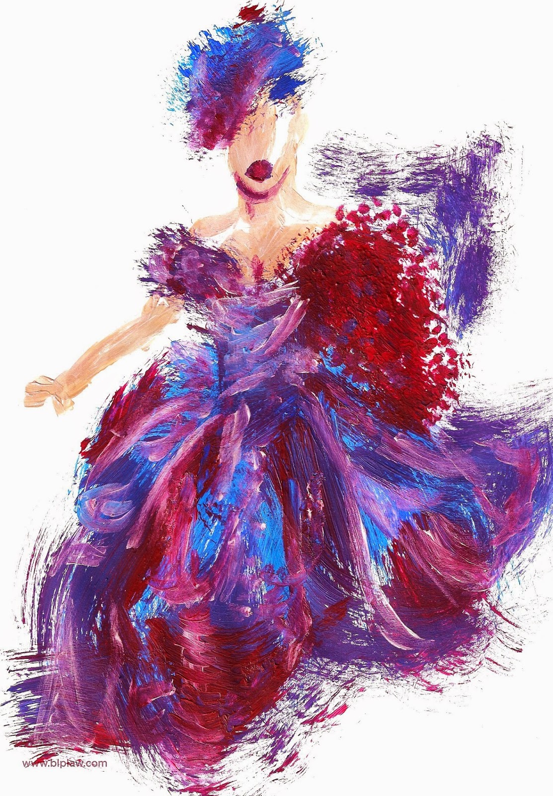
I also explored the texture that can be achieved when using paint. Below I used acrylic to convey movement and the texture of the Westwood garments. I used reference images from Followwestwoods Pinterest and bought out some of these details from the photographs when adding details to describe the models face, hair and form of the dress. I like the effect the paints texture has and I tried to use the brush strokes to effectively decribe the direction of the garment/hair/skin. I like the effect that the texture and shape had in these pieces but the media may not work in others as it is quite a bold medium to use and can take over the image.
(look at Eric Carle)


No comments:
Post a Comment