Thursday 24 October 2013

Task 5: Preparation for Screen Print: Rossington Street Print Room Induction

In this induction we were given a tour of the rooms equipment and facilities and we had the oppurtunity to try out some monoprints for ourselves. It was really good to learn how to do this process and I really liked the effect of a lot of my prints. However it is definitely something which follows the case that practice makes perfect as some of my prints were hard to make out due to my use of too much talcum powder or ink. However in some ways the effect caused are always one of a kind and just create a unique piece; it is part of the fun and interest of the image. 

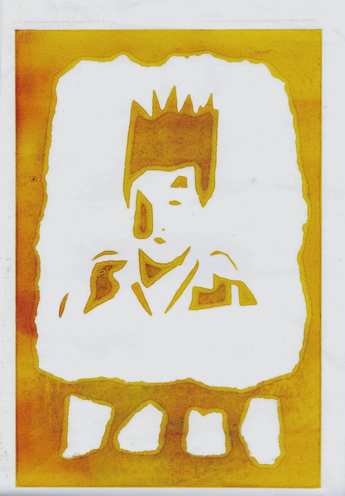
Here are some of my prints: 


Tuesday 22 October 2013

Task 3: Drawing as you See It- Line/Tone/Mark/Pattern

Drawing as you see it...Line/Tone/Mark/Pattern

Continuing to explore line drawing using ten different drawing tools, in response to my chosen visual subject; Punk, with a focus on drawn line, tone, made mark and pattern. I explore how pressure, stroke, direction and gesture dictate my line and how different paper can effect this. I used hatching, cross hatching, scribbling, shading and making marks and pattern in this brief. I used the line to describe light and form in both a very accurate and precise way but also a way that could be stylised or suggested. 

I continued practicing pen with continuous line and I have begun to add some patterns and think about pen strokes and direction and how pattern can work with blank space to create effect. 


I used pattern/made marks as a visual device to describe complex and detailed information such as...

Pattern was used here to create new planes/sense of depth to my drawing...

These patterns/made marks are highly controlled/manic and loose.


This is a sketch focusing on line, I used a reference photograph of some 'northern soul' dancers. I let direction of the strokes direct my line as I wanted to create movement in the blank space to mirror the dancers. I chose to only highlight a few parts of the other bodies on the page to add to the dance hall vibe when its dark with a few parts lit up- the spot light here is on the dancer and all his body is visable. I used coloured pencil to describe the background as I thought it worked well to juxtapose the clarity of the pen line and blank white space. 


Here I used a  lot of pressure to create boldness in the jacket. This was a quick sketch and I just wanted to experiment with a simple bold technique to portray this jacket. I think it worked in portraying the boldness of the jacket but overall I don't think it was a very successful piece as there is not much narrative or interest in the piece. Perhaps more made marks, patterns and cross hatching would have added interest to the jacket or the background/person around it. 


Here I used a find liner in black to draw out a punk's rebellious expression and I decided to fill in the shadows and darker shades of the image with a pattern. I think this worked well as it added some more interest to the image and it also worked well with the crazy message of the piece as the pattern is almost 'too much'. It almost rebels but still remains inside its borders. Perhaps to improve this piece I could explore allowing the crazy punky theme to let the patterns over run their borders and create mayhem on the page.


Above: Vivienne Westwood, and right; with her friends in her shop 'Sex'. I looked at line, form and tone here. I used orange to imbue an essence of her within the image; her ginger hair.  I think the gesture of the line work in the image really continues the wild and free theme that Vivienne Westwood is; the swirls of hair and curving lines suggest fun and the opposite of ordered and sensible. the directions of the swirls head outwards from the centre along with some of the fingers however most of the fingers point in; I think the direction of these lines helps the audience to be drawn to the centre of the image but to also notice her wild mane. The small amount of pressure I put on the pen was used to juxtapose the intensity of the image, I wanted it to feel balanced and I think this worked as it doesn not seem 'too much' yet still seems powerful.

Here I used different pressure to draw the dots and experimented using dots to create form. I like the effect the dots have and I found it meant my positioning of features was more accurate as with the dots you can carefully suggest them where as with line once its drawn its drawn. However this technique took much longer than drawing using line so if a piece was under time constraint this would not be an appropriate approach. I decided to centre the image on the face so used the most pen there and more loosely further away. I then added colour using coloured pencil and added some more pen dot marks with a fine liner:

The below illustrations are my interpretations of Vivienne Westwood's catwalk and print spreads.  I chose to focus on these as I could identify the punky edge to the garments and makeup and hair of the models. I used shapes of colour to map out the clothing using felt tip pens and then added water to make a water colour look. I left a lot of the page blank as I liked the relationship the colour had with the white space and how it allowed the colour to not overwhelm the image. I then added line, mark, pattern and tone using black fine liner to them to bring the image together and describe the garments and models features.  
I found that the paper I used for the below images really helped me to use the watercolour paintbrush with an accurate gesture as the paint didn't run where you didn't place it to and yet it was smooth enough to allow the pen to be applied at multiply pressures and the gesture of it was uninterrupted. 


I used pattern and made marks as a visual device to describe complex and detailed information such as his necklace and neckline, his beard and facial features, and the way the clothes fall to leave shadow on his body. Pattern was used here to create a sense of depth to my drawing as it adds more truth to the image and allows the garment to be identified as Vivienne Westwoods and also recognition of the model. The black also works well to tie in all the colours and patterns. The patterns and made marks are thought out but loose, however the shadows have had to be drawn over multiple times in order to create the depth so those marks are a lot more controlled. 

( Look up Yule Bringer & Nigel Peak)

Studio Brief 3- A Day in the Life

Brief: 
Produce 3 illustrations that visually communicate my response to 'Evolution and Bad Boyfriends' text. They need to be produced using two colours plus stock to the following three formats:
200mm x 200mm
105mm x 200mm (portrait)
290mm x 105mm (landscape)

They should be distinct but work as a set or series and be visually consistent.

Supporting Material:
http://www.jeanjullien.com/
http://barryblitt.com/stuff/
http://keithnegley.com/
http://joshcochran.com/work


After reading my text I picked out some key topics/words, for which I found five reference images and used them to create some collages in my sketchbook. My choice of words were; controlling parents (for this I found a stern looking middle aged woman), peacocking (when a male shows off to attract potential mates, for this I found a peacock showing off his tail to a peahen), resources (for this I found an image of falling pound coins), gambling (for this I found an image of dice; it refers to the gamble in genetics and also the traits of a bad boyfriend- gambling his resources instead of using them to provide for their offspring) and babies (signifying the survival of genetics- for this I found an image of two babies- this also portrays the idea of siblings and the parents choice between them, it states in the article that 'by helping their needier daughters, parents maximized their total number of surviving grandchildren'). 


Some of my experimental sketchbook work;

This is a primary photograph I used as reference for the right hand page below.


Above are a few pages from my sketchbook experimenting with ideas and media following the article and concentrating on a few key elements. 

This was some of the work from one of Freds workshops. The intention of this was to explore ideas and themes:

___________________________________________________


During a seminar with Fred we had to cut up 2 sheets of A1 paper into 34 rectangular strips of equal size. We then had to focus on one aspect of our project; I focused on the peacock and the desirable qualities it represents (as a bird- successful and desirable genetics suggesting strength and thus protection, as a man/boyfriend - success and thus useful resources/strength/protection). I replaced the 'eye' in the tail with a coin with the queens head on it. This signifies wealth and protection and success - just like the tail does for the peacock. This is relevant to my article as it represents the 'good boyfriend' this is the man with the resources; with the money and supplies to look after the woman and more importantly their children; the protection of their DNA. The 'grandparents' or 'overbearing parents' will not invest in this woman as she is already taken care of. 

The article looks at why, if both the woman and her parents both want the survival of their genes, their is conflict in mate choice. If the parents have more than one child, it is in their evolutionary interests to distribute their resources - money, support etc. The child, however, cares more about the survival of their genes than that of their siblings, so each child should try to secure more than his or her fair share of parental resources. In the article they talk about their computer model study in which they allowed a females parents to interfere with her choice of a male, and for parents to distribute their resources among their children. They found that parents invested more resources in daughters who chose mates with few resources because this daughter would profit more from extra help than her more fortunate sisters; and maximized their total number of surviving grandchildren. This unequal investment meant that daughters could 'exploit' this generosity; instead of holding out for the perfect man they could accept a less helpful partner whilst still ending up with a similar amount of support (from parents). As a result, the choosiness of females gradually declined over evolutionary time; simultaneously parental preference for caring sons-in-law increased.


Pages from my sketchbook: here I was thinking about the idea of parents having to put their resources (supplies and support) into their daughter with an unsupportive boyfriend. I drew this completely from my imagination and tried to use just two colours, pink and blue, however I did use different tones and shades of these two colours. I really like the effect of these two colours together as I think they compliment and contrast each other well; the warm and cool tones represent the good and bad relationships. I have depicted a scene of the unlucky in love daughter drowning without any air supplies or support from her boyfriend (instead he is swimming in the background), her parents have to use their own air supplies and support her in order for her and her unborn child, their genetics, to survive. Meanwhile, their other lucky in love daughter relaxes above water with as much air supplies she needs and is supported in a rubber ring by her boyfriend.


After having my one on one tutorial with Matt I decided to aim to create simpler images. Its natural for me to try to cram as much into one image as I can and I ended up (in the image above) condensing the whole meaning of the article into one frame. I thought I was on track with this and that I was responding to my brief, however Matt reminded me that the three images were just to complement the article and not to replace it. I then thought back to some of my earlier ideas and decided to continue with my peacock feather idea as this was one of my simpler ones. From the layout/frame exercise we did I knew how I wanted to arrange my feather on the page and decided to use it for the portrait piece because I think it looks like the strands are naturally flowing downwards and it leads the eye to the 'eye' of the tail. Here is an initial sketch for the tail: 


On the left is my peacock feather using monotone and replacing the 'eye' with a pound coin. On the right hand side is some faint pencil and biro sketches mapping out where I could have colour on my square design.
I decided on the colours pink and blue because of the fact that pink/red is often the colour of love or lust and dark blue to add some weight to the image and the meaning; the sad fact women are settling for less. I looked at using these colours for the peacock feather and I thought it worked well however after using it with my wedding toppers design I decided against it due to the wedding dress loosing relationship to its meaning as their was no white - it became less recognisable, this was true for the cake too. So I then decided to use black and white so that I could convey the images more clearly.


Beneath are some of my preliminary sketches for my final illustrations. I decided to use black pen as it conveyed the message at its most simplest and clearest form. I used two pens in differing thickness and concentrated on line to convey shadow and power.


Unfortunately I made a huge error when cutting the sizes and drawing the designs on; I cut one at the slightly wrong size and then confused that one with the wrong layout- so my portrait and landscape pieces are mixed round. I have learnt a huge lesson from this and it will be something I will definitely be checking again and again before finishing the illustration in future. If I were to do it again I would definitely ensure the correct sizes were used- this brief was really important in highlighting this issue. 

 Feedback

Evaluation