Wednesday 19 March 2014

Colour, Value and Notan

Value relates to the chroma, saturation, purity or intensity, of any given colour.
Notan is a Japanese concept of how light and dark within an image can create harmony, dynamicism or beauty. Notan formalises similar principles of value in the composition of artwork.

I found this helpful blog which talks about colour particularly in fashion: http://www.colourlovers.com/fashion/blog/2008/05/30/the-colors-of-wear-palettes 

Colour palettes are based on the principles of colour theory. Within your colour palette certain colours may contrast, accent, compliment, harmonise or vary. So when colouring your image, deciding the size and variety of your palette will dramatically change how your final work functions. 
I find myself trying to use contrasting/complimentary colours, opposite in the color wheel, in my pieces a lot as I feel the need to bring the piece to the audiences attention with these clashing colours; to me it makes each colour stand powerfully alone whilst still being part of the overall image. 
However I have been try to have a go at using limited and similar colours to see how effective this can be in my work and help to portray a certain message. 

To use colour palette theory myself I developed a colour illustration through a series of roughs which had to include an object and a figure. I chose to focus on children; first trying out a child interacting with a buggy but then deciding to use a child trying out lipstick. I decided on this figure and object because I think they're really relevant to our culture as the age of putting on large amounts of makeup everyday is getting younger and younger. 
I used a reference photograph however I adapted it and changed it. I decided to draw it out in pencil first:

Then crop it to make the lipstick and eyes looking into the mirror a clear foreground and I cropped it right at the side of the lips and the mouth to bring these aspects to attention rather than leave the whole face in. I also decided to leave a section of plain colour as background on the right to portray the sense that the girl is almost secretly putting on the makeup - she is hiding to the side of the canvas. 
After drawing it in detail using pencil I then edited it using photoshop to add colour and some white thin lines. I liked the realistic appearance pencil gave the image but after editing it on Photoshop I decided to re-design the image on illustrator instead as the colours were becoming too complex for me to just focus on three different components of the piece which is what I set out to do.


Here I have decided to try to use Adobe Illustrator to ensure my work fills the brief set as it was looking at three different colour values in one image. Below my work using this vector software, I have experimented with different colour backgrounds however I have focused on using three colour values: white (light), beige (and occassional background colour- medium colour value), and black/dark red (and occassional background colour- dark colour value). 


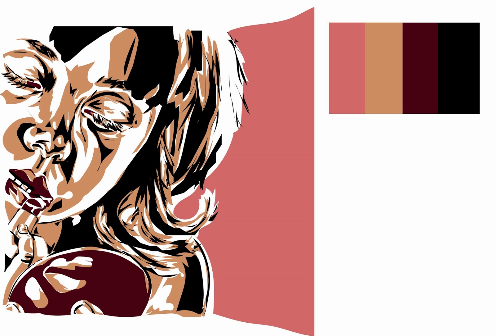
Overall I think learning colour theory is great as it gives you more understanding of colour and how multiple colours can interact. However I love creating work as I go and deciding on the colours depending on initiative and what seems to work best for that particular piece. I think these pieces worked well but I feel they are missing some passion which arguably may have been achieved if I was just creating it from fluid working rather than thinking about colour theory too much. There is a larger amount of light and mid values in this piece, representing the innocent child, however there is also a decent amount of dark values balancing out this corrupting object; makeup. The makeup; lipstick and back of mirror are both a dark red; portraying a sinister tone to the piece and highlighting the dangers of wearing a mask of a woman when you are in fact only a girl.

Monday 17 March 2014

Persons of Note: Yuri Gagarin

For this brief I have to produce a series of illustrations in response to a person of note. The series must exist across a range of different formats whilst maintaining a visual consistency throughout. These include:

  • 4 x stamps (5cm by 3cm)
  • 4 x Postcards (10.5cm by 21cm)
  • 1 x Poster (59.4cm x 42cm) 
For my person of note I decided on Yuri Gagarin who was the first man in outer space. He was known as a family man with a winning smile and toured the world after his trip to outer space, representing the successes of the Soviet Union and communist way. He had been picked from his competitor after years of training mainly due to his background; his parents lived on a communal farm and his story became one of hope and an example of how under communism anyone can succeed. His life soon turned down hill after affairs and he only went on one other space mission; in which he sadly died. This tragedy has a lot of speculation over it and his story goes from triumph to tragedy in a matter of years. However I want to focus on why he was a person of note; and this was not because of the latter years but because of his success as the first man to go to outer space and because of his triumphs in allowing the Soviet Union to be seen as a success and inspirational around the world. He had done something no other on earth had ever done; and he had done it before the USA!


http://www.nasa.gov/mission_pages/shuttle/sts1/gagarin_anniversary.html

Below are some of my research images to be used for reference in this project:


I researched deeply into his life and watched some documentaries about it which were extremely interesting. My main aspects I wish to focus on are of him being a family man, a handsome 'celebrity', an astronaut and as a product of the communist Soviet Union.

Below are some of my work from my sketchbook:


I really liked using collage however I decided to try using water colours as I wanted to use a particular colour scheme which may have been hard to find/achieve using collage given my time restraints. I decided to use the colour scheme of red and yellow as these represented the communist soviet party and this is extremely appropriate to incorporate into my work on Yuri Gagarin as he represented hope and the success of the party. He was used as an example; chosen as the first man to go into space due to his training and ability but also because of his background; a son of farmers from a communal farm. He showed how within a communist soviet society how everyone has an equal chance and anyone can be successful, to both the general soviet public and other nations. He toured the world representing his nation and its beliefs and was used as a promotional tool. He was also a family man (although by the downfall of his career his homelife broke down too with cheating allegations) during his success in space and presented this wholesome lifestyle during his fame afterwards. I have tried to present him in the prime of his career; portraying him as handsome (with a winning smile that 'lit up the cold war'), a family man, a communist/soviet, and an astronaut. He was a celebrity of his time.

Here are some of my pencil and water colour drawings exploring the above ideas:


I then decided to add a background using the layer tool on photoshop: 


I really liked the effect that having multiple layers created and how it enhanced the message of communism and the Soviet Union which is essential in this work. 

My final poster was created by using water colours and a few marks using felt tips. I wanted to portray the stars/space in the background whilst still using the colour scheme of red and yellow, and I also wanted to represent the Soviet Union with the communist symbol behind him to the right. I represented his successes in space using the medals and his charming smile to represent the successes of the Soviet Union and him as a family man as well as a heart throb.


Evaluations and Peer Crit:


After receiving this feedback and being able to look at other peoples work I scaled all my pieces to the correct size and then printed them out and worked on my blog further. Below is my final poster which I printed out at A2 using matt paper.


I think it would have been stronger and cleaner cut using digital but to represent the era and context I thought hand painted would be more appropriate. I think I could have made it more detailed however overall I think it works well and the colour scheme looks effective.

Sunday 16 March 2014

Greetings From...(Cities of the World - Post Card Project (2)

After researching into many different festivals from around the world, I decided to base my four postcards on festivals that took place in four specific cities which all vary a lot from each other. The cities I looked at were; Munich (Oktoberfest), Rio de Janeiro (Carnaval), Venice (Carnevale) and Delhi (Holi).

Delhi

At first I sketched out lots of ideas in my sketchbook using pencils. I then chose to combine some of these together to form one image. I drew it out in pencil first and then I used pen to draw a clear outlined line drawing of my final idea that I could use to work on digitally after I had scanned it on to the computer. I wanted to include lots of flowers and paint as this festival is a festival of colour and celebrates all that rich in it. I also chose to include an Indian Elephant and building to hint to the reader the location. I used reference images so that I could portray the objects and correct aesthetic to portray India. However I mainly used my own imagination for this piece- this was really crucial as I had to create a succinct image even though I was using multiple references. Below are some images from my work on illustrator:

I started off with some simple shapes to create the right atmosphere with the main colours in the piece. I chose warm tones of yellow and orange in order to portray Indias warmth and the exotic elements, and also to exaggerate a fun a happy atmosphere.
I kept the original pen drawing as a top layer in Multiply on Illustrator so that I had some guidelines to work to.


I then deleted the top layer and allowed only a few outlines to appear- I tried to avoid black as I felt this piece needed to be light and free in order to represent the festival and city. This postcard represented Delhi during the Holi festival which is a festival of colour. I used an expansive palette with a wife range of colours on this piece but I still tried to keep it all in sync with main colours such as reds, blues and yellows.
I also tried to use as little black as possible to keep it as fun and vibrant as I could. I included objects such as the building, the Indian elephant and clothing and makeup such as bindis to suggest location. The colours chosen also represent India in reflection to their spices and vast range of wild life.


Venice

I portrayed Venice through their festival carnival and used the layout of one of their gondolas to present the illustration.
I used some reference images of costumes but only used these for some information, most of the patterns and colours I made up. I wanted to portray the mystery and romance of the city and the festival so I used couples and a small hanging light giving off some warm tones into the dark. I used black to enforce the mysterious element and some pink tones to suggest lust. I also used blue to represent the canals and yellows to show the fun of the city and festival.
I also used my initial sketch as a guideline in this piece; after scanning it in I worked on it on Illustrator placing it as a top layer using Multiply. This meant the colours could be added and worked on seperately to the original illustration.


Munich
For this German city I was focusing on the beer festival held there called Oktoberfest; the biggest of it's kind in the world. I wanted to capture the merriment and main components of the festival: beer, music and dancing. Much of the festival is held in massive tents with lots of decorative ribbons and hangings, this is why I used the tent shape as a border for the image.
First I drew out some separate components I wanted to include in the piece which I thought captured the city at festival time:

I then mapped out how I could arrange these within the border:
 Using Paint I cut and pasted the more detailed drawings on top of the composition plan:
 I then started adding shapes and experimenting with colour on Adobe Illustrator:


 I decided that perhaps darkening the background would make the image look less cluttered and also add some more depth to the piece with shadow and highlights. I also darkened the main girls lips, lightened her skin, added a red border around the bottom to make a more finished effect and added some white marks to highlight around the beer in the centre:


Rio de Janeiro
As I felt my previous postcards were far too over crowded and not very effective in portraying one simple message, I decided to just focus in on one figure for my Rio postcard. I obviously studied the fabulous costumes of the dancers on the floats and parades. The costumes are vibrant, fun, sexy and colourful and really reflect the vibe of the city and the festival. I tried to convey this using Adobe Illustrator and using a variation of reference photographs to work from as well as experimenting and adding colours and details myself.

First I drew a rough design of the figure in pencil and then used it as a layer to trace the image over the top. The original drawing:


I made the background a slightly more subtle shade of pink as I liked the contrast between the colours but I thought that the headdress and feathers on her costume should stand out away from the background. The colours in the image above clash and distract from the subject matter (even though the bright pink did add vibrance in reflection of the festival itself).


I decided to add some pattern in the space around the feathers as I thought it looked a bit bare in the above image and the added pink 'feathers' add even more power and impact to the movement of the image. 


I made the lips slightly darker (below) as I thought they looked slightly too light being the same shade as the background. If I had more time I would experiment more so with the colour scheme especially the background and lip colours. 


I then made the lips slightly more vibrant again...


After I had scaled them to the correct size on Photoshop I then printed them off, however this went very badly as the colours, which is one of the main aspects in the work, came out completely differently and far more bland. 


I was unable to get the colours to come out right using that specific printer so I managed to find another to use. This time however I had even worse problems as the computer I was using to print them off didn't have Illustrator and so would not open up my images. To solve this problem I used jpeg versions of them to open using Photoshop. I was scared that this would mean that they lost some details or clarity however it seemed to work successfully. I then scaled them again down to the correct sizes and printed them all out. 
However again I had a problem as because there is some white space around the edges of my images, it is hard to see where the postcards ends and begins. I tried to add a border on Photoshop but I could not find out how to do this. My printer then started to print them out too cropped however by changing a few of the printer page settings I managed to solve this. In order to be able to see where to cut out the postcard I added some digitally drawn borders using a colour already in the image. 
This solved my problem but I am not as happy with the final outcomes. I dont think they look very succinct or clear and if I were to do this again I would definitely rethink how I drew the borders and explore how to make the borders as effective as possible. I also would try not having a border but instead cropping the images so that colour took up the majority of the image. Scale and layout is definitely something I really need to get my head around while I am designing the initial sketches and not just have as an after thought.