I chose the YCN GAP brief because I thought I would be able to produce some work which I am interested in already; fashion illustration. The aim was to produce a promotional campaign that lured students into the GAP shops. Currently this age range doesn't have GAP on their radar.
I know that as part of advertising it is more about selling the lifestyle/ the person than the object/garment itself. I started this project by brainstorming key words and mantras that the company holds in high regard; the project pack held useful information about the company too. My main focus was to keep a simple content; ideally the final image would have been really simple however my work involves a lot of detail and pattern and mark-making so even though I started off with a simple idea, my work evolved into a final image more complicated. This is something I need to work on in my work- it worked best for the company's brand image to keep it simple!
So, with my simple, uncomplicated and relaxed mantra in my head I decided to begin by using water colours to paint two blocks of navy, with a gap in the middle. (Navy being the company's signature colour.) I then began to sketch out a few ideas of young people on top of the paint in pencil and pen.
After my first experiments I decided the gaps between the colours weren't clear enough so I painted some more strips of navy paint with a narrower gap between to make it clearer. I then thought about what the context of the characters in my images needed to be to attract their target audience. I decided that basing it on lust and relationships was the most likely to attract a young audience particularly students during freshers week. With this in mind I found images from a number of sources that reflected a diverse range of relationships/situations e.g. the LGBT community.
The process of creating the illustrations was quite complicated as I started off by drawing onto the paint with white pen, then adding silver and black pen in specific places such as the eyes and jaw line. I didn't stick to my reference images but I used them as a basic guide line to poses and positions of features. It was fun to create this work as the majority of it was imagination led. I chose to use white against the navy as this contrasted more so would stand out most in a design such as a shop window or poster. Once I was happy with the analogue images I scanned them and began working them on Photoshop.
Unfortunately I made a huge error by working on these original images in my sketchbook because it was not watercolour paper so when I scanned them in the paper was not flat. This meant that when adjusting Levels in Photoshop my work did not have a stable background; instead having large patches of shadow and highlights. I decided to fix this by getting rid of all the outlying marks on the white, then by selecting the navy strips and adding more dark blue colour to the dark patches to get a more stable overall block colour. The project pack included the logo so I used the colour from there to ensure my images stuck to the brand image.
However, once I started painting the background colour it obviously began to erase the white line marks of the characters. In order to ensure these were not lost, before I started painting in the navy, on another layer I drew over all the white lines in a white paint brush tool. I decided to make this brush slightly smaller than the original lines as I thought the effect of a light blue with a thinner white line in the middle would create a cool luminous effect. I was actually really happy with this effect however the patterns themselves weren't executed as flawlessly as they could have been as I just used a mouse due to the Wacom tablets being occupied in the studio.
If I was to do this brief again I would definitely select fewer final images to work on as I think the quantity of work I decided to create gave myself a larger workload than was necessary. I would also make the image simpler and the message clearer. Although I am happy with the aesthetics of my final work and I think the 'Bridge the GAP' slogan works really well with the characters. My slogan was meant to highlight the importance of simplifying everything; relationships and clothes. Freshers is a confusing and complicated time so this mantra should attract students looking for some calm and simplicity.
Saturday 21 March 2015
Responsive: Save the Children: Read on Get on
I chose YCN's Save the Children; 'Read on Get on' brief for my main individual practice brief. This was because I wanted to push myself out of my current comfort zone and more towards children's illustration.
I began to research into some of my favourite children's book illustrator's such as Dr Seuss and Quentin Blake as I just love the expression and imagination in their work and I knew this was an extremely important part of the work I wanted to produce.
The cause, of course, was another huge reason for me to choose this brief as I am extremely passionate about reading and the importance and power of education. I am a babysitter and I have also worked in a Montessori nursery (where the children lead their own learning using specialised toys and tools) and I always spend at least 20 minutes reading to the children or hearing them read, in both cases the children I look after want to and enjoy reading and listening to the stories even though they may need you to keep them from getting distracted! So it is crucial that parents are encouraging this natural enthusiasm and making time for it - at least 10 minutes as the campaign suggests!
This campaign's target audience is dads, especially families from a working class background as the reading age is statistically lower. This is an extremely sensitive and emotional issue as it could easily sound condescending to parents who don't have much extra time and may not be used to reading themselves so may find it a daunting task to spend time reading with their child. Just because they are not reading to their child doesn't mean they are not spending quality time on their child. So I decided it was crucial that my promotional work was friendly, relaxed and encouraging. I wanted to take away the pressure and replace it with the sense of fun.
I started by sketching a lot of character ideas; experimenting with poses and props. I decided to have a dad with a few children to add a sense of disorganisation and distracted children- the reality of reading to children. I wanted a range of ages of children and genders; not just a girly or boy thing to read. I also wanted to represent the dad not as some stereotypical intellectual but a burly manly-man. Hopefully this would encourage men that you don't have to be an oxford graduate or a female to read to your children.
The process of creating the illustrations began by sketching in black pen into a brown paper sketchbook. I then photographed the work I selected to work further on and started to work on it using Photoshop. I wanted to add colour but I wasn't sure which ones. I started off by trying a simple blue and pink. After experimenting with a range of colour palettes I decided to use the colours from the 'Read on, Get on' logo in order to stick to the brand image. I added some rosy cheeks using the paint tool and got rid of the sketchbook background creating a clear white background instead. I also adjusted levels however mostly I kept the sketch close to the original image as I wanted the doodle-aestheic to link to the context of children's play.
I then chose a quote I love by Dr. Seuss 'You're never too old, too wacky, too wild, to pick up a book and read to a child', to include in my promotional poster. I also included some key information and contact information from the project pack to include on my poster. I had to include the logo which was also included in the project pack. I decided to use red and black for my font to stick to the brand image. Overall I am really pleased with my final outcome and I think it works well compositionally and fits well to the Save the Children brand along with communicating the message of the brief. However, if I were to do it again I would spend longer adding colour to the image as I don't think this looks professional enough.
Wednesday 18 March 2015
Responsive: Scavi & Ray
YCN's Scavi & Ray's brief was the one chosen by my partner and I for our collaborative project. We chose this brief because we thought it worked well for the elements we were both interested in; portraiture and fashion illustration. It also had a lot of creative freedom as the company wanted to be portrayed as 'fruity, light, and fresh' elements that are not linked directly to Prosecco so allow us as illustrators to use lots of other imagery to portray this mantra.
We began by brainstorming key elements we wanted to include in our promotional material. We then did some market research, which included me going to a fashion show, to decide on the type of promotional material we wanted to create. I thought things like calypso wrappers or refreshment carts etc would be good for the fashion show part however we decided to stick to a more simple advertising scheme with posters, bus stops and bill boards.
We decided to create two formats; a banner format and a poster. From there we went back to the drawing board and each came up with some initial ideas. Abby thought that red and navy were key colours in the most recent Vogue issue so we had ago at creating some work following this colour palette. I think this was a really good idea and start however I don't think it worked very effectively with the brand itself and their 'fresh', 'light' and 'fruity' identity. Navy and red seemed to serious; love not lust. So we met up again and decided to create some mood boards for our colour palettes. I was in charge of this and decided to base it on the cocktail flavours as we had both decided that our portraits would have the drinks flowing into ingredients into the bodies/faces- transparent skin. Similar to these artists:
For the colour palette mood board I did a lot of research into the potential cocktails you can make using Prosecco. I split the page into sections for the different cocktails and used water colour and pen to convey the different ingredients. I kept the colours light and vibrant as I wanted to portray this 'fresh' feel. I think this was really useful as it gave us a clear board to go back and forth from while working on our final illustrations. It was really important to both be on the same page for this as we were both doing similar parts in the project.
After we had a clear understanding of the general feel of our project we did some more research, this time focussing on the aspect of a 'girly night out'. I did a photo-shoot using cocktail glasses and memorabilia such as umbrellas and stirrers and used two girls as my models. I also used props such as sunglasses and sun hats to add a fun, carefree summer vibe to the photographs. I used these photographs as a reference and created some initial sketches from them. Abby did the same with her own images and we met up and compared what we had produced. We also shared our reference photographs with each other using a private Facebook Album which was really useful as Abby then went through and chose out of my selection of photographs which ones she liked, which made narrowing them down a lot easier. After we had met up we decided that we would combine our work together by drawing outlines for each other and then filling in the other persons outline.
I found this part of the collaboration the hardest. All the previous decision making had been quite clear as to the direction we both wanted to go with the brief. However, actually working with someone else's illustration felt really odd and I found it hard to know how to combine my own work in with a thick outline as it is the opposite to the way I work - usually I start off with colours or paint to get a general feel- here my outline was already made. I also found it really hard to hand over an outline to Abby to work with as I wasn't happy with the outlines I made- obviously they were unfinished so I wouldn't be - but I still found it a struggle! I decided to overcome this issue by using the light-box to draw a faint outline of the outline I was given and then fill in that page with flowers and fruit etc. I found this way of working a lot easier as I felt much more free. I then used Photoshop to combine these two images. I also worked a lot more on the content (the flowers and fruit etc) by using the Paint tool to add a white line around the images to continue with the 'light' feel. I also edited Levels and Saturation, and added some faces to some of the illustrated outlines. I wasn't very sure about my final work however I knew they were good enough to work with further in a poster/banner layout combined with other images.
Abby then took over compiling the images together into the poster and banner layouts and she did an amazing job by making them all fit well together compositionally and aesthetically. She also linked them together by added paint splashes to the background of the images. We kept our 'fresh' and 'light' colour scheme and stuck to girly colours such as peaches and pinks to stick to the brief of appealing to a target audience of young fun-loving girls out drinking with their friends.
I then took over the work adding logo and the slogan 'Lighten up your day with Scavi & Ray'. This was actually quite hard for me as composition and layout is probably my biggest weakness! I wanted to use a white font to continue with the key element of 'lightness', however this meant that I had to then add a more block colour layer beneath it so that it stood out. I also had to make the font quite large so that it would be visible in context. I used the font that was included in the project pack in order to stick to the company brand image, however during our final peer review we got comments that this did not work with the logo- even though it was exactly the same font. I think these comments were more to do with the size of the font rather than the font itself, however we decided to keep it bigger for practical reasons of the public being able to read it. If we were to do this brief again we could spend longer trying out size combinations, perhaps making the logo itself bigger would have worked more effectively!
I was also in charge of putting our promotional material in context. I had no idea how to do this to begin with as I am not very experienced with a range of tools in photoshop! However I decided to do this part as it is extremely useful to know how to create mock ups. So after learning the complicated step of clicking the distort tool… I began to adjust our work to the contextual objects such as bus stops, bill boards, and general posters. I used Layers to ensure a realistic look and I am really happy with how they turned out- definitely a simple skill I will be using a lot in future projects!
Overall I am really happy with the way that Abby and I worked together as we could have hugely clashed seeing as our work is very similar in the way that we are both illustrators and enjoy doing portraiture. But luckily we managed to give up enough control over our own work to allow each other to have a go at contributing together to create a final outcome we have both put a lot of work into. I am not sure how professional our final posters look; mostly down to the way I have positioned the font and logo etc, yet I feel we have been successful in collaborating and working as a team.
Tuesday 17 March 2015
OUIL505: Feminist Artists
http://www.arthistoryarchive.com/arthistory/feminist/
There are loads of blogs popping up embracing feminism which I think is really reflective of young idealised celebrities declaring they are feminists and that they can still be feminine too. Women like Jennifer Lawerance have a huge following based on their 'normal' appeal… she is funny, she is strong, she is brave. She has a voice and it's one many can relate to. These blogs help to convey the online presence of feminism in a relaxed and funny way, which is great as it allows people to view feminism as a natural thing; for equal rights, rather than a strict old movement.
http://www.hercampus.com/school/wisconsin/oh-so-you-think-youre-not-feminist-feministrantahead
OUIL505: Creating a Brief
BA (Hons) Illustration – Level 05
0UIL505 Illustration 2: Applied Illustration – Studio Brief
2
Brief Title: A range of self-empowering beauty and
educational products for women and the LGBT community reflecting the aims and
themes of Third-wave Feminism.
Brief:
·
To create a surface pattern design that can be
potentially made into a range of proposed products and packaging. Combine the elements of typical girly factors
such as flowers and intricate ornate designs with empowering images and slogans
or key words relating to the aims of third-wave feminism. Colour scheme should
be in line with typically girly colours or juxtapositions such as really
masculine powerful colours such as red and black. The overall appearance of the
product should be quality.
Product:
·
Make-up bag/ pencil case/ book mark/ posters.
·
Key product: create a surface pattern design.
Tone of Voice:
·
Open minded/ Third-wave feminist.
Audience:
·
Women and members of the LGBT community that
would be interested in buying or receiving a makeup bag/other various products
based on the themes and aims of Third-wave Feminism.
·
Age: Teens and above.
Context:
·
Third-wave Feminism: One of their focuses: Girl Power- ‘Power exercised girls; A
self-reliant attitude among girls and young women manifested in ambition,
assertiveness, and individualism.’
·
Another focus: Choice and Empowerment- including embracing the female form – in a
powerful way- goddesses/empresses/queens etc/mothers breast feeding etc.
·
Another focus: Queer and non-white women, and Gender Theory: abolishing gender role expectations and stereotypes.
Additional
Information/Considerations:
·
May need to talk to student services office
about potential posters supporting the aims of third-wave feminism.
·
May need to arrange a workshop on the sewing
machines.
·
Research:
·
LIL KIM/ Kelis/ Beyonce/ Rihanna/ Nicki Minaj/
TLC/ Destinys Child/ Lily Allen/ Missy Elliot/ The Pill/ Jonny Hannah/ Oliver
Jeffers/ Sister Corita/ William Morris.
Mandatory
Requirements:
·
Explore and research in depth the context of my
product both regarding market research/target audience and the themes and aims
of Third-wave Feminism.
·
Explore, research and experiment with surface
pattern and practical techniques.
·
Keep blog up to date with work and progress
throughout as well as continuous evaluation.
·
Visual research in the form of a sketchbook and
any 3D work practicing techniques such as sewing etc.
·
Final product or at least proposed products
drawn out in detail and different angles etc.
Deliverables:
·
4 Mood Boards
·
Sketchbook with ideas and visual research
included
·
Blog with up to date analysis of work, as well
as artist and contextual research.
·
Final product.
·
Proposed products (on board/drafts in
sketchbook).
Sunday 15 March 2015
Responsive: Robyn Shaw Zine
 |
| On set with fashion communicator Robyn Shaw and model Helena Bradshaw during a shoot for Robyn's fashion zine. In the zine there will be a combination of interviews, photoshoots and some illustrations. |
Brief 1: I will be creating some illustrations from backstage on this shoot and try to capture the atmosphere of the two working together for the readers. This shoot concentrated on four looks; androgynous, vintage, grunge and gangster.
Brief 2: I will also be creating some more finalised illustrations for Robyn to include in her zine replacing selected photographs from her Harvey Nichols photo-shoot, which was in itself a collaboration between herself and a photographer using the set and clothes of Harvey Nichols, Leeds.
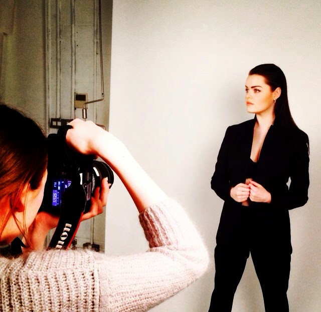

Below are some of my illustrations combining quick sketches on set with more detailed secondary observations from my own photographs:


Tuesday 10 March 2015
Responsive: Alice in Wonderland
I chose YCN's Pan MacMillan's 'Alice's Adventures in Wonderland' brief as one of my individual projects. The brief was to create a new cover and up to two interior page illustrations. The aim was to enchant a whole new readership by creating new interpretations of scenes that have been drawn before or entirely new ones.
I started off with the idea to draw the missing scene 'The Wasp in a Wig', a scene which Lewis Carroll decided to suppress. It involved what was described as 'a wasp in a wig' (possibly a play on the commonplace expression 'bee in the bonnet'). It has been suggested by Carroll's nephew, Stuart Dodgson Collingwood, that one of the reasons for this suppression was due to the suggestion of his illustrator, John Tenniel. In a letter to Carroll, dated 1 June 1870, Tenniel wrote:
I started off with the idea to draw the missing scene 'The Wasp in a Wig', a scene which Lewis Carroll decided to suppress. It involved what was described as 'a wasp in a wig' (possibly a play on the commonplace expression 'bee in the bonnet'). It has been suggested by Carroll's nephew, Stuart Dodgson Collingwood, that one of the reasons for this suppression was due to the suggestion of his illustrator, John Tenniel. In a letter to Carroll, dated 1 June 1870, Tenniel wrote:
'…I am bound to say that the 'wasp' chapter doesn't interest me in the least, and I can't see my way to a picture. If you want to shorten the book, I can't help thinking - with all submission- that there is your opportunity.'
John Fleming, a Manhattan book dealer won a bid on the missing chapter, for £1,700. The contents were subsequently published in Martin Gardener's The Annotated Alice: The Definitive Edition, and also as a hardback book The Wasp in a Wig: A Suppressed Episode. The rediscovered section describes Alice's encounter with a wasp wearing a yellow wig, and includes a full previously unpublished poem. It would have been at the end of chapter 8- the encounter with the White Knight.
However unfortunately this is in the second book 'Through the Looking Glass' so I didn't think it would be appropriate for this brief. However I previously named my illustration blog on Tumblr the name 'A Wasp in a Wig' for this reason; to emphasise the power of the illustrator, and also to link to the character Alice in Wonderland which I share the same name… and hair!
For this brief I decided to instead focus on the opening scene for my cover page and a part of Chapter 2 in which Alice is crying so much that she can swim in her tears. I chose these scenes as I thought they would be really fun to draw and the imagery is really effective even just through the words conjuring up a visual in your imagination. I really like the sense of peaceful nature in the first scene particularly as it is such a large juxtaposition between the coming scenes in the book where everything is out of order. I chose to capture this serenity in my illustration with the river and flowers but also hint at where the adventure begins; with Alice peering at the rabbit about to embark down a hole. In the second illustration I really wanted to portray a feeling of claustrophobia as this is when she has just eaten the cake and doubled in size. I did this by giving the illustration edges that she is pushing between, the scene is also filling up with tears enforcing the claustrophobic element.
The process of making the illustration started by reading the specific part of the book, and then I went straight onto drawing the image in pencil in my sketchbook. Once I was happy with the image I used watercolours to paint on initial colours and create a handmade feel with brush strokes etc. I then went over my original pencil lines in a black fine liner once the paint had dried. After this I scanned in my images and then used Photoshop to edit them. I wanted a clear white background which was quite hard as their was quite a lot of paint and pen marks overlapping onto the background. I then adjusted Levels to ensure the pen lines were a powerful black and then I added Layers of colour using the Paint Brush tool. I wanted to keep the handmade painted textures but add a more overall block colour. This took a while to get a look I was happy with but I finally managed it.
I would have created a more sinister or crazy illustration to juxtapose the usual Alice in Wonderland illustrations; but I wanted to stick to a simple but pretty aesthetic in order to appeal to the target audience. Primary audience; parents of girls aged 5-9. Secondary audience; parents of boys aged 5-9 and gift givers.
I also had to create two covers; one with the Macmillan Alice 150 Logo and one without. Luckily I had factored this in when designing the original illustrations by making the top curved like a tree.
Overall I am really happy with the work I managed to produce as I wanted to create a combination between analogue and digital to represent the relationship between the past and present in relation to the book and its continued relevance. I could definitely improve the work perhaps by changing colours to a simpler colour scheme to make it look more professional and maybe adjusting layout to be more symmetrical/straighter lines.
A selection of entries will be displayed at our offices in King's Cross, on Pan MacMillan's website and on the Alice Facebook page.
Responsive Brief: Coco Chanel: final work

I chose to work on a brief from Pushkin Press, the aim was to depict a new cover for The Allure of Chanel. I found this quite an intimidating brief as the book had previously been illustrated by fashion illustrator Karl Lagerfeld. The book is about the woman who founded Chanel, Coco Chanel, and goes into the designers mind. In my final outcome I really wanted to depict the true Coco. In order to do this I did a lot of research and found out about her as a person as well as a designer. Above, is my final outcome for this piece, depicting Coco Chanel 'relaxing' in the middle of reading a book; however I wanted to portray her as alert and challenging the viewer, you have not caught her in a private moment, she is the one who's caught you watching! I used a water colour and pencil sketch scanned into the computer and then worked onto it using Photoshop. I used mainly Layers and the Paint Brush tool. I wanted to keep some hand made elements but also bring some modern elements into the piece by giving her a more realistic look to there face and garments. I spent a while on the pearls as these are such a huge part of her brand identity so I wanted to ensure they were highlighted correctly to draw the viewers attention to them. Below is my original sketch; I painted some water colour basic shapes and lines and then drew over it in pencil.

I researched for some reference images to use for direction on her face and expression; (these were all found on the Vogue Website)


I loved all of this images particularly the last one as I think this depicts Coco's personality so well, showing the exactitude, presision and perfection in her garments and herself. However I finally chose to use this image (below) as I believe that she connects to the viewer in a way that she would have looked at her contemporaries, not giving too much away but a hint of seduction and analysis. The photograph also highlights her notorious pearls.

I also used this image of a book for a reference image as she learnt not from private education but through reading and educated herself. I wanted my illustration to depict her caught in a moment of interruption during her reading; the audience enters her world for a brief moment. She's watching you; challenging you.

Monday 9 March 2015
Responsive Brief: Coco Chanel
The Allure of Chanel - Pushkin Press
Design a cover image.
Research:
http://www.chanel.com/en_GB/fashion/haute-couture.html
http://fashion.telegraph.co.uk/article/TMG7975778/The-secret-life-of-Coco-Chanel.html
https://instagram.com/chanelofficial
https://www.youtube.com/user/CHANEL/videos
Design a cover image.
Research:
http://www.chanel.com/en_GB/fashion/haute-couture.html
http://fashion.telegraph.co.uk/article/TMG7975778/The-secret-life-of-Coco-Chanel.html
https://instagram.com/chanelofficial
https://www.youtube.com/user/CHANEL/videos
Sunday 8 March 2015
Font: Kenzo
The font works really well for this brand as it's all about shapes, lines and cutouts. The font really helps to accentuate monochrome garments in this promotional work.


Saturday 7 March 2015
Responsive collab cocktail/ingredient/colour schemes


Using the ingredients for these cocktails for inspiration I created a mood board for our colour palette throughout this brief:

OUIL505: Sketchbook; Dolce & Gabbana
Dolce & Gabbana
 |
| A fine liner and felt tip drawing of a naked woman. I wanted to incorporate the floral pattern from Liberty's collection into the skin of the woman; symbolic of both the veins and nature in human life and to highlight this in females: legend had it that women were created from the inside of a rose; hence why pink was chosen as the colour to represent and dress them. |
 |
| Above: My interpretation of Dolce and Gabbana's Viva La Mamma catwalk show, in which the models carried babies with them down the catwalk in celebration of motherhood. I paired this with a drawing of a model celebrating gay pride with rainbows and colour irradiating from him as he walks. I started to think about the relationship between Dolce and Gabbanas views on 'artificial babies' and their own sexuality. I wanted to create a pattern that is inspired by their own detailed work, that includes symbols such as test tubes etc. |
The link below embraces the Viva la Mamma catwalk show from Dolce and Gabbana; describing the models and clothes entwined with their theme of embracing a photogenic motherhood:
http://www.theguardian.com/fashion/2015/mar/01/dolce-gabbana-celebrates-motherhood-at-milan-fashion-week
This link tells a different perspective on the show and designs; not truly representing motherhood, more just using it as a prop to sell their designs:
http://time.com/3728185/dolce-and-gabbana-viva-la-mamma-milan-fashion-week/
Another controversial issue arose when D&G spoke out in an Italian magazine about 'artificial babies', which grabbed the attention of hugely influential star Sir Elton John. This bought a great amount of publicity to the issue, described in the article linked below:
http://www.telegraph.co.uk/news/celebritynews/11473198/Sir-Elton-John-calls-for-Dolce-and-Gabbana-boycott-after-row-over-same-sex-families.html


Subscribe to:
Posts (Atom)