Tuesday 9 December 2014

Moving and Printed Pictures- Progress Review: Group

Before the group peer assessed my work I wrote out three questions for them to answer in reference to my work...
  1. What media do you think would look best for my animation stings? e.g. paint or pen line.
  2. Do you think I should include quotes from my texts (in printed pictures) below the print/around it/next page?
  3. Do you think the colour scheme in my practice prints work with the magical A Midsummer Night's Dream theme?
Feedback: 
  • Really lovely drawing exploration - would be cool to see more of your print development
  • Sketchpad is great, can see youve done a lot of observational. Lot's of experimentation too. 
  • I am confused what are you producing towards your final again?
  • Great scratch effect on the lino prints.
  • Look at Charlotte Smith moving GIFs
  • Jan Klassen - light
As a peer group we went around the room looking and commenting on each others work. This was really good to see what level everyone was up to and the quantity and quality of work across the class. I thought everyone's projects looked really good and it really reminded me how much experimental work I need to produce. It also helped to see the different uses of media used across the class; I really liked a technique where the student had stuck down tin foil and then stuck cut out paper over the top. It created a really nice metalic effect and seemed easier to create it that way than cutting out the tin foil itself. This is a technique I would like to experiment with for my animation work as I want to include metallic media to emphasis the magical theme in the play. 

We then focused on individuals work with a partner and reviewed their sketchbook and developmental work and their blogs.

The feedback I received:

Comment on the practical development of work for the Moving Pictures Brief. Is there sufficient evidence of practically investigating selected processes and techniques.
Lots of story boarding.
Good experimentation with media for story boarding it that is your intended aesthetic for final animations. Maybe simplify story boards, do some concept sketches to get the aesthetic down and make a short. Bit more explanation on the blog posts as well.

Comment on the practical development of work for the Printed Pictures Brief. Is there sufficient evidence of practically investigating selected processes and techniques. 
Evidenced extensive research/thumbnailings.
Not fully clear on ideas for final result; only a few lino tests of one design; more extensive investigation required in medium.
12 prints seems ambitions, choose strongest themes (6-8) consider other options that might sit better with your thumbnails.

Comment on the clarity with which the development of concepts, ideas and practical solutions has been documented on the studio practice blog. 
Lots of contextual references but blog posts need explanation so we know what we're looking at. Try and start using ISSU to tidy blog up. Try and reduce amount of text to relevant points- quite hard to follow- make more regular posts.

Comment on the extent to which the planning of time and resources has been effectively considered in order to enable the production of the proposed work in the time available, (are the action plans and project management sheets specific with regards to workload, deadlines and timescales?)
Cut down amount of prints you propose to do in relation to work you already have allocate time to finalise print compositions and printing and don't forget about animation.

What suggestions can you make 
Strengths

  • Lots of experimentation.
  • Strong concepts.
  • Imagery taken from texts.
  • Lot's of blog posts.
Improvements
  • Direct these stings more in to the final direction.
  • Pick out strongest and make work more concise.
  • Need to be more concise - more pics, less texts.

Overall group feedback for over the Christmas holidays: WORK SMART!
  • Clearly identify your work.
  • Labels - make sure your work is clear and that the module code is in front of 'studio brief 1' etc. 
  • Organised - Physically separate and order. E.g. reference images etc in a folder. 
  • Evaluate on blog - especially pictures.
  • Production issues must be taken into account.
  • Animation- watch World Stare Competition - simple is effective!
  • Story boards- animation.
  • Blog decisions and problem solving - everyday!
  • All work evidenced - feedback and evaluate!
  • Folders for documents.
  • DO AN END OF MODULE FORM EVALUATION - NOW! 

Wednesday 3 December 2014

Moving Pictures: Inpiration

I could buy a book and take pictures of it opening like this then it staying opened. I could then print them off for the background for my frames which I will then draw the scene on top of.

4 scenes - 

Colours- I think it would look really cool with colour depicting the mood/magic of the night or the sun rising/setting depending on what part I am depicting. 


Printed Pictures: Inspiration


Moving Pictures: Text

Decision-making on text in animation: exactly what text is required?
3-6 10second stings:
Author name: William Shakespeare
Title of text: A Midsummer Night's Dream
Publisher: Thomas Fisher, 1600
My made up republication: Random House, 2015

Typeface or handwriting?
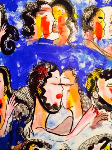
Hand written type face because I want to incorporate into the sting such as the moons reflection/contextual pattern/tree's branches/facial expressions/bodies transforming into the words. The resolution will be clear like the rest of the image and will be clear and on screen for at least 3 seconds of the 10 second stings. It will form at the end of each of the stings and be created using the same media as the rest of the animation so that it works with the aesthetic of rest of the images. With this in mind the text will have a dark and magical/mysterious theme to it.

How will I layout text and consider design?
Words will form out of the woods etc, they may be slightly unevenly lined up purely as I will need it to fit into the letters into the background however, hopefully, this will give it a more mysterious/magical feel as it is not ordered perfectly.
Duration will be at least 3 seconds giving the audience a time to read it and take it in.
The font will be influenced by the historical context.
Colour decisions will depend on background colours and the mood of the scene.
The scale should be an appropriate size to fit on one 'page' as it would take up the entire sting duration if I had it bigger.

Identify 2 research sources of effective use of type with moving image, which will inform the use of type for your animation...
I will look into book release animation adverts and hand drawn opening credits for mystery/magical programmes/films.

Perhaps Baskerville.