Tuesday 22 March 2016
Q&A Saturday: Viscom Vicky
- What does Viscom mean to you? Are there any limits to what you can create?
Throughout my time on Viscom I have been encouraged me to make my work socially engaging and think more about the concept or the effects that my work has on other people which has given me a whole new approach to things, not just within my work. There aren't many limits in what you can create on Viscom, I think this freedom is what attracted me to the course. - Why did you choose to study a creative subject as a degree?
It wasn't really a decision I remember making. This is probably because I always knew I wanted to, there was no question about it. Being creative and producing artwork has always been something I've loved doing. - What has been your favourite project so far?
Never thought I'd say thing but probably COP3, my dissertation module. Even though I'm not great at writing essays, I think the fact it made me really investigate into a topic that I was producing practical work along side gave the project a lot more depth. I also liked it because I got to make a book and I love making books! - Who are your favourite practitioners?
Alice Dear, she is my hero. - Have you ever produced art you hate?
All the time, I'm probably too critical of my own work. I rarely actually like my own work. - What most inspires you to create work?
A lot of things. I looked around open studios at the weekend for example and seeing other practitioners creating all different kinds of work and hearing them speak about how much they love what they do inspired me to come home and create things. If there is a subject or a topic I want to create work about that can be inspiring too. - What is your favourite song/musician to create work to?
I listen to really weird music when I do work, it's got to be something quite subtle in which I don't know very well or I end up getting distracted and singing and dancing along. - How does living with other creatives impact your own practice?
It's great when we all discuss ideas and help each other out and everyone is interested in what everyone else is doing which is encouraging. Also there is the extra bonus of being able to borrow equipment from each other. - Who has your dream career? (or what would yours be?)
NO. Alice do not ask me this question at this moment in time!
The Illustration
Process
Review
Sunday 13 March 2016
Wednesday 9 March 2016
Progress Crit - Peer and Tutor Feedback from Patrick and Jamie
I found this peer review really helpful and it was great to see the versatility in all of our final projects.
Peer Review Feedback 1
Comment on the breadth of initial ideas produced in response to the brief?
Strengths
So much work! Really great printmaking. The lino prints are great.
Suggestions
Do more lino prints on to dark backgrounds. I'd love to see more god prints.
Comment on the scope and scale of the development of ideas in response to the brief?
Strengths
Huge range of ideas being developed.
Suggestions
Might need narrowing down slightly. 1 media maybe? (my note: NO, this will not happen.) I think the project just needs a specific outcome to work to.
Comment on the visual quality of the final resolution.
Strengths
Visual quality of the prints is very high. The 3D stuff you're making is really interesting. Love the black and gold print.
Suggestions
Some of the drawings feel slightly rushed, would have been nice to see the prints without the watermark (my note: what is this refering to? Is this about the digital versions of A Midsummer Night's Dream inspired prints from last year?). Try some foil prints.
Comment on the effectiveness of the proposed resolution in response to the problem set.
Strengths
The idea of producing a body of work to begin with is working really well for you.
Suggestions
Is a book the most appropriate outcome? It seems that maybe an exhibition might be more appropriate, a book wouldn't do the prints justice. (my note: for the final exhibition the pieces will all be displayed etc but I am doing a book as well because I just want to tie all of my work together into a comprehensive collection).
Peer Review Feedback 2
Comment on the breadth of initial ideas produced in response to the brief?
Strengths
The project is quite personal to you, which is good because after graduation you probably want to get as much time to do things like this! A lot of ideas for end products- books, prints etc.
Suggestions
I think it would be good to experiment printing onto other things than just paper! Why not make cushions/home products with your prints on them. (my note: be aware that printed textiles know their craft and will be doing this)
Comment on the scope and scale of the development of ideas in response to the brief?
Strengths
There is potential to do a lot of things with this brief which is really good! - Could even propose to make more things based on your trip after graduation. Such as developing some home products with prints based on India- because I think it would really sell!
Suggestions
Really go wild with your ideas! There is just so much you can do with this! But maybe concentrate on the things you really want to do first - and do that excellently.
Comment on the visual quality of the final resolution.
Strengths
Moving onto lino printing is really good- there is some really nice mark making going on! Also forces you to think about using shapes too instead of just lines!
Suggestions
I like the beginnings of your Indian Elephant. It reminds me of the decor things that can be put in children's bedrooms. Maybe you could explore this type of work more - make plushies or something!
Comment on the effectiveness of the proposed resolution in response to the problem set.
Strengths
The yoga prints are really good - all of them are actually! I can see them displayed in places that teach yoga, they have that feel to them.
Suggestions
As your project is really personal. I think that what you have proposed to do so far is quite effective for impproving and building up your image making skills.
Jamie Mill's Feedback
- Translation of photographs into printmaking.
- Colour choices and scale are great - BE AMBITIOUS.
- Initial sketching/ trials and ideas?
- Next steps with lino? Reductive? More colours?
- Dan Howden, Jonny Hannah.
- Reportage - something particular you are trying to say?
- Events? Moments? People?
- Drawings into lino- process - elevation, how do you translate the strengths in your drawings into the prints?
- Yoga poses could work as a series - feels quite seperate though - this is not a bad thing, more commercial.
- FOCUS ON: Evoking meaning rather than presenting the truth.
Self Evaluation
I think my prints and mark making works well and I will capitalise on this by creating prints from drawings as reference and by creating loads of reportage work! Quick and expressive drawings.
I think my colour palette and stock could be improved which will benefit my work as it will elevate the whole artwork to a higher quality if the stock is improved to a higher standard.
Next time, I would use better stock and coloured ink and also try different techniques like reductive lino from this I would achieve a higher quality item and a more visually interesting print.
What have I learnt by responding to this brief and why is it important?
What? The media used really impacts the content/concept.
Why? It all works together to evoke a feeling.
What? Mark making is crucial.
Why? Especially in reportage - it reflects my own interpretation of the world and the shapes I see.
What? Large scale drawings and paintings.
Why? It creates an environment almost. The scene takes in the audience a lot more at this larger scale.
What have I gained from this peer feedback session?
Everyone likes the analogue work - prints and large scale drawings. They like the idea of cropping/stitching/multimedia etc. Better stock and colour combinations. They weren't fans of digital versions.
A2 Multimedia Drawings
These drawings are following on in the theme of my temple drawing. I used mixed media because sometimes I feel like the illustration needs the rugged but detailed mark making of the pencil crayon with the juxtaposition of the smooth block of colour achieved from the paints. I am really happy with these because I actually really enjoy working at a larger scale, it makes my work feel a lot more free and spontaneous. I think working onto an already coloured piece of paper is really pushing me to work with colour in a different way too. I have always loved using a wide range of colour for my palettes but by using coloured card already I have to think about how I use this range of colour to draw attention to the right elements in the image. I love pink and yellow in this piece, I also love the pink and turquoise so I used this as shadow instead of black. I think the slightly more neutral red tones help to add depth to the image because of the pink paper.

CROPS
This image is a much bigger illustration than I am used to, this is great for me as it means I can pick out and select some parts with a crop to emphasis particular elements in the piece.
This image is a much bigger illustration than I am used to, this is great for me as it means I can pick out and select some parts with a crop to emphasis particular elements in the piece.
 |
| Focus here is put onto the bust (head and shoulders) and pouring activity of the woman. |
 |
| The focus here is on the yellow of the dress in juxtaposition to the rest of the image - this is because the saaris I saw during my time in India were so vibrant and amazingly crafted and put together by the wearer that they stood out like princesses or exotic birds among the natural colours of their surroundings. |

CROP
 |
| This illustration is of a man who was delivering eggs. It was a ridiculous and slightly stressful sight for a westerner like me to witness... I was carefully treading along a high up rubbly path, trying not to fall into the paddy fields beneath, while I look up and try to move out of the way of a not very impressed Indian man with a huge pile of eggs balanced on top of his head. I loved doing this illustration, the large scale of the piece, and the media I used really allowed me to let loose with my mark making and line work. I love the contrast of the green and orange, and I like how because the whole piece has been carefully considered with thought put into each section- it means that where ever you crop it there is an interesting bit of paint or line work and colouring. |
I have added this brief to my website; it already contained some of my prints but now it can display some of my more refined/cropped/adapted images from my brief...
http://alicedear.co.uk/Southern-India-Reportage-Brief
Peacocks
Peacocks are a bird that are prevalent throughout Indian decoration and art, so I decided to have a go at making my own interpretations. I used gouache because of its strong, vibrant colours, and water colour flexibility/consistency.
 |
| Here is one of my gouache illustrations of peacocks. I love painting and it always pushes my creative freedom even if I use reference I never rely on it much when I am painting- where as if I am using plain pencil I often end up trying to create something as close to the reference as possible. |
 |
| Playing with brush strokes and colour palettes in gouache. |
 |
| This is the preliminary gouache illustration without the addition of black pen line. I researched into peacocks before starting this illustration because I needed a reminder of their form and features. However for the actual illustration itself I just had fun with my own creation of the peacock and its chicks. I wanted all of their heads and bodies to be in different positions to add some balance to the piece. |
 |
| This is my final mothers day card design - it was just for my own mum so I didn't think about the background and font too much. Of course if I was to create a more professional looking card I would alter the font and background to give it a more thought out and appropriate look. |
 |
| I wanted to see if removing the background would make the illustration look smarter; more finished and professional. I think the negative space does this by making it look more clean cut but it does look lacking in a way, and with the warmth from the sun missing, I think the piece looks a bit cold and not as heart felt. |
CROPS
I didn't think that the final illustration looked as professional as I wanted. I thought this could be down to the layout and composition so cropping it may help to create a more finished piece. Cropping it meant that I could focus on the protective elements of the idea of a mother, and the cute vulnerability of her children being kept safe. Cropping it so that only some of the mother is on show also helps to give the audience a view point of the chick etc - the outsider has a full view of the scene but the cropping allows the audience to feel more involved in the scene and with the characters (the chick may not be able to see the entirety of his mother from his low down position.) Cropping also gives focus to the peacocks most recognisable or visually interesting elements (such as the tail or legs) that you may not be drawn to with the whole illustration.
I didn't think that the final illustration looked as professional as I wanted. I thought this could be down to the layout and composition so cropping it may help to create a more finished piece. Cropping it meant that I could focus on the protective elements of the idea of a mother, and the cute vulnerability of her children being kept safe. Cropping it so that only some of the mother is on show also helps to give the audience a view point of the chick etc - the outsider has a full view of the scene but the cropping allows the audience to feel more involved in the scene and with the characters (the chick may not be able to see the entirety of his mother from his low down position.) Cropping also gives focus to the peacocks most recognisable or visually interesting elements (such as the tail or legs) that you may not be drawn to with the whole illustration.


 |
| I adapted this illustrations colour palette using Photoshop. I actually don't really like this version as much, I prefer the reddy warm tones, but it is good to know that this versatility is possible digitally as colours can completely alter the meaning of the piece. |

Crispin Orthotics Brief - Email.
DEADLINE: 5pm 1st April.
Sharon Heleine has just sent through the briefs and information so now I can get started on producing work for this project!
My Expression of Interest statement:
This work is aimed to add some elegance, fun and beauty to the prosthetics! Flamingos are very in at the moment in fashion and in high street stores because of their extravagant and eye catching exotic appearance, I think that these traits which draw an audience to flamingos should be the same positive traits which draw the eye to a prosthetic. Great purpose for this brief – I hope there are lots of great designs submitted!
Sharon Heleine has just sent through the briefs and information so now I can get started on producing work for this project!
Dear Student
Thank you for your interest in the Crispin Orthotics Competition. Please see attached the written brief, together with an Expression of Interest form. If you would like to enter the competition and submit some designs, please read the brief, and return the Expression of Interest with a maximum of two images, by 5pm on Friday 1 April. Each image should be no larger than 1MB. If you would like to submit more than 2 images, you may do so under a separate email and Expression of Interest. Expressions of Interest and images should be emailed to sharon.heleine@leeds-art.ac.uk
If you would like to see some details of the presentation given by Mark Thaxter and Emily Jameson on 2 March, please see estudio, right hand pane ‘Online Resources’. Go to Enterprise and Employability/Life After College/Crispin Presentation at the bottom of the page. I will add the brief and Expression of Interest to the same area of estudio.
I will forward all Expressions of Interest and images to the Crispin Orthotics Managing Director Mark Thaxter on Monday 4 April. The winners will be announced later in April.
I look forward to receiving your images and Expressions of Interest.
My Expression of Interest statement:
This work is aimed to add some elegance, fun and beauty to the prosthetics! Flamingos are very in at the moment in fashion and in high street stores because of their extravagant and eye catching exotic appearance, I think that these traits which draw an audience to flamingos should be the same positive traits which draw the eye to a prosthetic. Great purpose for this brief – I hope there are lots of great designs submitted!
My Images:
 |
| This design is for day to day wear. Bright and vibrant this should help the wearer to feel positive and happy when looking at it. Flamingos stand on one leg all the time; it is part of their intrigue and beauty, so I hope that this will help the wearer feel like the prosthetic is a unique positive rather than a negative. |
 |
| This design is for a smart occasion such as work or a night out. It is smart but quirky, the black background makes it less noticeable than the above design, however the white outline appears luminous like it is lit up which creates a more exciting night time mood. |
Q&A Saturday: Jessie's Answers
- A desire to be expressive with my mark making, and often original in what I do.
- Pretty late at night when there are no other distractions and the incentive of sleep to motivate towards. I'm also a fiend for doing a lot of what I'm not supposed to be doing - give me two briefs and I'll become incredibly inspired for the one that isn't due imminently.
- Not especially, but it has been an area that I can get to learn more about and so some of the themes or things that I notice there have filtered into my work, much like with my cop project last year - and the practical outcomes about individuality in the military.
- It was quite a big transitions in many ways, but it took me a while to realise that. I missed things like mud and grass lol. I have also never been very good at crossing the road.
- That's a hard one to answer as I'm not sure what I could compare it with to notice the difference myself. I was incredibly oblivious of the Northern and Southern er, difference that is all the rage in England. From growing up in Scotland I can appreciate milder temperatures, 15 degrees is tropical to me, and anything above 20 can and will give me sunburn.
- It's always hard to pick favourites, but Sarah Maycock has been one that I have continually referenced throughout my degree. Recently I have been looking at the likes of Gustav klimt, Kandinsky and Picasso!
- My final project is about sharks. I think they're beautiful and impressive creatures so I'd love to learn more about them and also investigate into the reasons as to why people are so instilled with dread about them. I want to discover what might persuade people to reconsider them for the well designed creatures that they are and that are important to their ocean communities.
- I think the dream job would be traversing across the world and drawing lovely creatures like birds and sharks. I'd be interested in using my illustrations to help with the conservation of them.
- It's hard to pick a favourite, they all have their merits (and their woes). It was quite a feeling of accomplishment to write and bind a dissertation. The practical drawing project I worked on for this years COP was also an interesting and successful investigation into drawing. It has arguably brought on my abilities the most, and influenced my perspectives in terms of what I can get out of drawing.
- Instagram: jessiembroad
Website: http://cargocollective.com/jessiebroad
Twitter: https://twitter.com/JessieBroad_
sorry about the long delay Alice!
Monday 7 March 2016
India Brief: Needle and Thread London
This designer popped up on Instagram but I have been aware of them for a while because I watch some of Tanya Burr's YouTube Videos and she often mentions them as one of her favourite dress designers. They have such beautifully ditched and embroidered garments which is pretty rare for high street brands but something a 'magpie' like myself loves! I thought this was great inspiration for my India brief as I definitely want to incorporate some of the handmade element of crafts into my work as people around me when I visited were constantly DIY-ing, even when it came to electrics and building houses in the monsoon!

Q&A Saturday: Jessie Broad Illustrator


Jessie gave me these photographs to use as reference for her portrait. I decided to use crayola but then realised I was working on a small scale and the crayola on blue paper wasn't making the image very clear - I then added pencil- which is probably where I went wrong. The end result was randomly proportions because of the changes in media and I don't really like the general aesthetic (although I do like the mark making that comes from using crayola).

So in the studio today I took another photograph of Jessie (mainly because I loved her image of the birds which she was holding up) and I think it conveys her well -along with what Fred refered to as her 'larder' aka her draw full of work (snacks).

India Brief and Bird House Inspiration
I like these interactive and 3D elements in the birdhouse design below that I found on Pinterest when researching for my SunDIY project. I like the idea of having a big Indian scene and then there could be pins which embroidered animals etc like the Indian Elephant I previously made could hang off. 
SunDIY: Bird House
On Sunday I decided to decorate a bird house I bought for a pound ages ago. I had a few ideas of things to paint on it, such as colourful birds, or little hearts in red and white, but I decided to have a look on Pinterest to see if that would inspire me more. It was so interesting to see how many people have decorated their bird houses in really creative ways. A lot of people had actually designed and made the bird house structurally unique- looking like little hobbit houses etc or using found objects like door key holes as the birds entrance.
These nautical themed beach house style bird houses are so cute and slightly kitsch, but seeing as I haven't done anything along this theme before I think this would be fun for me to have a go at!
These nautical themed beach house style bird houses are so cute and slightly kitsch, but seeing as I haven't done anything along this theme before I think this would be fun for me to have a go at!

 |
| I really like the simplicity of this bird house. It has a really rustic look - which may be literal rust or made to look that way on rough painted wood! I like the burst of vibrant colour on the top and bottom. |
 |
| This bird house design gave me the idea of adding decorations to the top of the bird house - the design doesn't have to end at the painting. |
 |
| You can even attach objects to the bottom as the birdhouse is usually hanging - or just suspended on a wooden pole etc. You could attach some small decorations that fit with the theme of the painting on the rest of the house. |
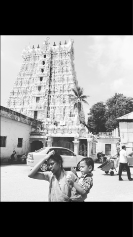
Temple Drawing!
Feedback from most of my tutorials have liked the idea of doing large scale drawings and paintings inspired by my trip there - using my sketchbook and my own primary photographs for reference. I started drawing a scene from a temple into card with some thick blunt pencils from the studio at uni. I liked using these as tools because they stopped me being a perfectionist about form and let me focus on conveying the right mood and motion of the scene. Obviously I used my photograph as reference but because I took the photo, I have my own memories from the event so I can combine this into the illustration.
 |
| I used some warm vibrant yellow paper as a base because India is all about colour, so I wanted to ensure I started off the piece with a blast of colour. because there is a lot of white in the image the yellow background also enabled me to draw attention to the white elements. |
Sunday 6 March 2016
Saturday 5 March 2016
India Lino Prints Part 2
Find a few of my prints on the post below (scroll past the Lino Prints based on A Midsummer Night's Dream) - these have been digitally enhanced, to make them look more professional and clear online, with Photoshop.
These pictures of the prints are ones that were just taken off my Iphone camera and then edited on apps such as instagram:
See all my Photoshop edited prints on the ISSUU link here:
These pictures of the prints are ones that were just taken off my Iphone camera and then edited on apps such as instagram:
See all my Photoshop edited prints on the ISSUU link here:
Wednesday 2 March 2016
Crispin Orthotics Briefing
Notes
http://www.thealternativelimbproject.com/project/feather-armour/
http://www.tedbaker.com/uk/Womens/Accessories/Bags/SIERRA-Stencilled-Stem-medium-suitcase-Black/p/128632-00-BLACK
http://www.tedbaker.com/uk/Womens/Accessories/Bags/ALANIE-Hanging-Gardens-medium-suitcase-Nude-Pink/p/128635-57-NUDE-PINK
https://www.victoriassecret.com/sleepwear/most-loved-pj-shop/the-mayfair-pajama?ProductID=284739&CatalogueType=OLS/
https://www.victoriassecret.com/sleepwear/most-loved-pj-shop/the-mayfair-pajama?ProductID=284734&CatalogueType=OLS
Also I was thinking that sportswear would be a really good source of inspiration as well as high fashion- I want to create something funky and vibrant or smart and chic. We have to submit two designs so these will be the two themes I will be focusing on. I will draw on sports brands like Adidas for inspiration because they use really colourful jazzy prints and patterns whilst still including some illustrated elements like birds etc, I think this will add some fun, vibrance and excitement into the prosthetic- obviously this is for a cooler audience than the audience for a princess design that may already exist - this cool adult audience getting prosthetics neeeeeds some cool designs! So the other design I want to propose will probably be monochrome - something smart and professional looking - something you can wear with a smart outfit such as for work. (I think it would be cool to add something subtly quirky within the design too though - such as a flamingo!)
Q&A Saturday: Viscom Vicky Questions
- What does Viscom mean to you? Are there any limits to what you can create?
- Why did you choose to study a creative subject as a degree?
- What has been your favourite project so far?
- Who are your favourite practitioners?
- Who do you think is the most controversial individual in the art world at the moment?
- Have you ever produced art you hate?
- What most inspires you to create work?
- What is your favourite song/musician to create work to?
- How does living with other creatives impact your own practice?
- Who has your dream career? (or what would yours be?)
SunDIY: Indian Elephant 28/02/16
 |
| As part of this SunDIY I continued with my Indian Elephant design. I think I am practically done with this one, I will just be stuffing it (with cotton wool rather than tissue paper, which I used before to little success) and then sewing it up. I am not sure yet if I want the stitches to be visible or not. It will look more professional if I sew the majority of it inside out so that no stitches can be seen, but it might look more hand crafted and colourful to make the stitches a part of the design. This week I added another colour thread to the design near the hole, which I previously bought at Leeds market the other day. I also added some turquoise petals to the orange stitches by the 'ear'. I don't want to over complicate the design because I could continue sewing into it - but I want to make the image of the elephant clear so I may leave it at this - however I am tempted to do some type of design up the trunk. I will have a think about this and decide on the weekend. |
Tuesday 1 March 2016
Secret 7
Deadline: 11.59pm 2nd March


For this brief I started off by reading all of the essential information provided on the website. I then decided that the best way for me to create an album cover for this work is to just listen to the piece again and again without looking at previous covers etc and just paint my interpretation of the song and lyrics. I chose this song by Chvrches out of the list:
I decided on this song because it is really lively, emotional, vibrant and atmospheric. It also has a really nice rhythm which is good to paint to as it influences your brush strokes. The lyrics are:
"Light, it's all over us
Like it always wasLike it always was
Shape by the clearest blue
But it's not enough
It's not enough, not enough
Just another time we're caught inside
Every open eye
Holding on tightly to the sides
Never quite learning why
You'll meet me, you'll meet me
You'll meet me halfway
Whenever I feel it coming on
You can be well aware
If ever I try to push you away
You can just keep me there
So please say you'll meet me
Meet me halfway
Tied to the shifting ground
Like I always was
Like I always was
You, were the perfect star
But it's not enough, it's not enough
Not enough, not enough
Just another time that I go down
But you were keeping up
Holding to a hope you undermined
Never to be reversed
Just another time we're caught inside
Every open eye
Holding on tightly to the sides
Never quite learning why
Whenever I feel it coming on
You can be well aware
If ever I try to push you away
You can just keep me tell me
Tell me tell me, you'll meet me
Tell me tell me, you'll keep me
Tell me tell me, you'll meet me
Will you meet me more than halfway
Shape by the clearest blue
Shape by the clearest blue"
The parts that I highlighted are the bits which are repeated or that stood out to me the most when listening to the song, so became the parts that influenced my illustration the most. I chose to start off through painting because this is always one medium I feel expressive and free in - unlike pencil etc. I feel that painting really lends itself to capturing the atmosphere of the moment, I like to use it instinctively and intuitively. I did not plan it before because I think music is about evoking a reaction and emotion, interpretation rather than a strict order. Because of the name sake I chose to use blue as the colour palette. I am thinking now though that maybe keeping everything but the eyes or the heart a different colour could make it look more effective. The clearest blue could be so clear in juxtaposition to the other colour - I will experiment on photoshop.
'Meet me halfway' - there are two characters in this plot. I wanted to depict them as quite anonymous without reference - which is why I used stickmen - this also links to the music as it allows anyone to relate to it. I used a white line to split the page and to split the characters. It is hard to tell if they are meeting or parting because I felt that like the song, there needed to be some ambiguity. The lyrics talking about pushing away but keeping there etc- a lot of juxtapositions but it all make sense to us as our emotions are constantly changing/juxtaposing when it comes to 'love'.
'Every open eye' - is repeated. I used stick men but I wanted it to be obvious that they are 'tied' to each other- I used their eyes to make this clear by looking back at each other while their bodies are facing the other way.
At the moment I have painted the piece and I am just using Photoshop to add specific details and colouring. It must be finished tonight so I am going to try not to over-complicate it and keep it to a simple message/mood of the piece.
Options
Options


Focusing on the theme of an anonymous, relatable couple and
the ambiguity and juxtapositions of emotions- the white line splits the page
and their reaching hands.


Materials
Yesterday I went to the Leeds market with Fashion Communication student Robyn Shaw to get a range of thick coloured thread as I ran out (some of it was used for the SunDIY elephant) and some material to sew into. I got some plain pieces at half a metre, and then I got £3.50 worth of a a blue design with an ornate 'teardrop' pattern. It was really good going with Robyn as she helped me choose materials using cotton etc that were best for sewing and stitching into.
'Paisley or Paisley pattern is a term in English for a design using the buta or boteh, a droplet-shaped vegetable motif of Persian (i.e. Iranian) origin. Such designs became very popular in the West in the 18th and 19th centuries, following imports of post-Mughal versions of the design from India, especially in the form of Kashmir shawls, and were then imitated locally. The pattern is sometimes called Persian pickles by American traditionalists, especially quilt-makers, or "Welsh pears" in Welsh textiles as far back as 1888.' - Wikipedia.
What is the Buta?
'Buta (Persian: بته), (Azerbaijani: Buta) – is an almond-shaped ornament with a sharp-curved upper end.[1] Buta motif belongs to Iranian culture. It is broadly famed in Iran, Azerbaijan, Turkey and countries of the Near East.
Patterns and ornaments of buta motifs can be found on Azerbaijani rugs, kalaghai and textiles, paintings of decorative-applied arts of Azerbaijan and also in decorations of architectural monuments.
“Buta” is a typical detail of Azerbaijani national ornaments. This motif is considered as the most ancient among all national ornaments of Azerbaijan. There are many printed items decorated only with buta. Buta motif was frequently used by Azerbaijani masters. Buta has a lot species and each of them has its own symbolical meaning. But buta is widely spread in Ganja, where it has become an integral part of carpet ornaments.
Buta is displayed in the emblem of the 2012 FIFA U-17 Women's World Cup, which has been held in Azerbaijan.'
I will be using these materials to finish off my Indian elephant (perhaps make more of different sizes and designs) and also to use the thread to draw illustrations from my travels. I want to use the photograph I took of the eggman in Kovalum beach to transfer to a sewn illustration because there was so many vibrant colours within the image!
Lino Prints
I bought a load of Lino of varying sizes (some I cut down to be smaller- which I forgot to trim before I painted which was a mistake because they looked less professional and more wonky as prints - for example the yoga pose print).
I decided to do a range of 3 prints based on the 3 general themes in my India Brief. The first was a reportage style image based on one of my photographs from the Kerala Backwaters. This print really focuses on setting the scene; a fluid combination of nature and people living within in; how I feel this part of India interacted with nature. The second was an image inspired by some already existed artwork of gods which I then drew into further adding patterns and details like flowers and the peacock- everything added was also inspired by what I remember seeing a lot of in the artwork in South India. The third was a small print of a yoga pose. The reason I plan on doing a set of these and why I think they are so good to produce in print form is because the poses in reality are all about balance and stability- something I feel Lino cuts will reflect well because of the secure and stable media. Balance and symmetry will look affective in the prints and should look more visually appealing than if something was 'off' not in the line of balance etc- it's human nature to find this comforting/visually appealing.
The Printing Process
I spent the morning in the print room experimenting with colours and combinations. Prior to this I had bought a range of coloured card and paper that I thought would work to an Indian colour scheme - bright, rich colours like yellows pinks and vibrant greens. Because some of my prints were so cut into, some of them were slightly less pressured in parts so came out a bit faded but I just added some more layers in the press and this fixed the problem.
[INSERT SLIGHTLY FADED IMAGE -PURPLE GOD?]
[INSERT SLIGHTLY FADED IMAGE -PURPLE GOD?]
With some of my prints the colours didn't come out as well as I wanted on the coloured card. For example on this gold and black print the edges look blurred. This was because initially I used gold Lino on the outer part of the print and red in the centre. The red failed to show up on the black card so I set the print again on top in gold- I hoped to line it up perfectly but this was almost impossible so it created a blurry effect on the edges with a clear centre. This was a mistake but I think does look quite cool even if it doesn't look as professional.
[BLURRY GOLD AND BLACK?]
In another print I experimented printing two colours - red and purple- on top of each other which actually came out really well because it added to a sense of mystery and other-worldliness on the gods print. Sometimes the colours over lapped and in other parts they came through as single clear reds and purples.
[OVERLAPPING RED AND PUPRLE]
I like to use the roller to add different layers of ink and different colours on one print- this stops the blurry effect which happened previously yet still achieves a variety of tones and colours on the initial print.
[PRINT USING MULTIPLE COLOURS]
I liked the symmetry and simplicity of the yoga pose print. It meant that it could be rotated or paired with others without changing its meaning. Such as here in my set of three purple prints on white, and my rotated/symmetrical pair of gold on black prints.
[YOGA PRINT]
I really enjoyed using a larger Lino plate than usual for my Kerala Backwaters print. It gave me more freedom in my illustration and worked really well for the trees and background, mid ground and foreground in the image.
[BACKWATERS PRINT]
This is a process which worked really well with the themes, atmosphere and visual quality I wanted to produce in this brief. For this reason, and because I enjoy the process, I will be continuing to create and print Lino. I think the next thing for me to focus on will be a set of Lino prints based on yoga poses. These can then be applied to multiple other things e.g. tea towels, yoga matts, yoga bolsters, coasters etc.
During this time I will also aim to create a set inspired by my favourite photographs from my travels and a set from Indian gods - perhaps just focussing on a selection of the Hindu gods.
Subscribe to:
Posts (Atom)