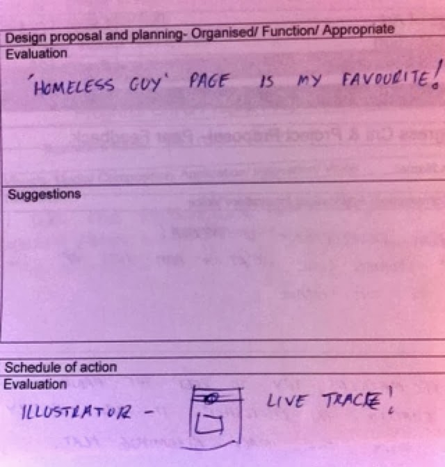
This is my Project Proposal for Studio Brief 2. I managed to stick to this proposal over the next few weeks and researched and investigated coffee shop history and the social reasons for going to them. I interviewed some people about why and in what circumstances they go to coffee shops and what they talked about there. The majority who answered were women; they usually stated it was one or more of these reasons:

- For a break in town.
- To catch up with friends.
- To refresh themselves/ their children.
- To gossip/ have an intimate talk.
This tells me that coffee shops provide a safe environment. Unlike restaurants people are generally not rushing you to leave your seat and so it is a perfect setting, with comfy seats and low lighting and music, to have a conversation or a rest that isn't rushed. This is useful to me as it reminds me that the atmosphere; lighting, decoration and furniture is key; this I will aim to convey in my book by using warm colour tones and by drawing attention to this 'typical' coffee shop layout.
Conversations are clearly key to this project, however I want to portray the modern day general public as being obsessed with technology, in particular their phones. So I have decided that while some conversations will be taking place, a lot will be lacking due to the customers dedication to their mobile phone. In my project proposal I stated that I was trying to achieve a book that would: Inform, promote and document and this is still the case and will be kept in mind throughout the project in relation to documenting our contemporary standard coffee shops and societies antisocial behavior; but particularly in the form of technology.
I still feel that I could combine some history within the book so started thinking about how I could visually portray facts and historical events about coffee shops:
I was also experimenting with different techniques and line work to see what would look the most effective. I liked how the simple monotone line drawings were relatable but still could be elaborate in detail.
I wanted to combine the past with the present in the form of a constantina style of book, with the images on one side present day, and on the other the past.
My sketchbook notes on ideas for the book based in a coffee shop:
It is hard to conduce this all into a small book but I am trying to portray at least some of these aspects when creating my illustrations. I also wrote notes about what was key to the book as a whole:
I thought it would be a fun idea to reveal information on each page, and the thought of having parts cut out to reveal the previous page is something I will think about when planning my illustrations.
I did some more trips to coffee shops and recorded more notes and sketches studying social commentary and the publics interaction in coffee shops particularly with their technology:
Below is a list of rules I came up with after spending time in coffee shops focusing on how people behave and interact. If you were to go against one of these rules it would be slightly 'taboo' although this is a recent development as in my research into coffee houses it is clear they used to be a place for discussion, politics and interaction between the many different people in society; nowadays this would not be socially acceptable!
I visually researched the components of a coffee shop from primary observations in my sketch book:
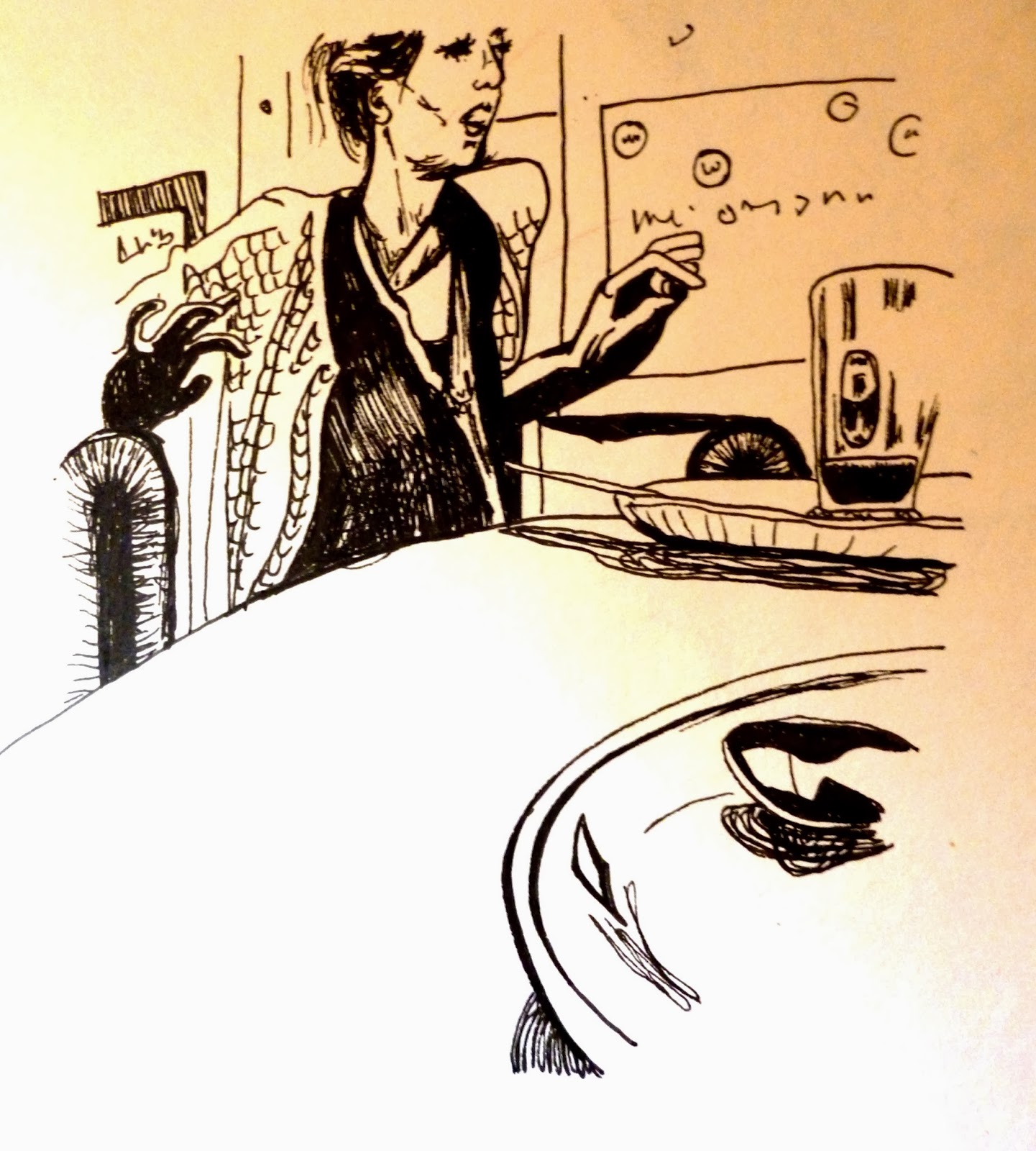
I also took photographs and then drew characters using these as reference:
I practiced using cut out sections to purposefully reveal certain elements of the previous page and also portray how it actually is in a coffee shop; with numerous factors interacting together to form the entire scene:
I thought this was successful and I decided to keep this in mind for my final book with each page acting as a part of the scene, which is the whole book.
I knew that I wanted my book pages to be angled at different perspectives with foregrounds and backgrounds so I kept this in mind when taking my photographs and illustrating preliminary work.
I then decided to experiment with media more and added colour, using pro markers, to some copies of my line work drawings and doodling over photographs in coloured pencil and pen to highlight what we cannot see: the concentration and connections towards technology rather than your company:
Overall I really loved drawing these secondary observations and I liked using colours, shapes and words to highlight certain themes and important points within the images. I loved the effect but after thinking through the process of book making, I realised that to create an equal standard of images on each page I would have to conduct a photoshoot in a coffee shop and use different models in each scene to create the look of a busy coffee shop. This would be a problem and would not be a sensible idea to carry out as I am on a strict time schedule so I decided to solve this problem by thinking about other ways I could create scenes without relying on reference so heavily. Keeping in mind my notes from throughout the project and the key themes I wanted to keep in mind in my book:
I decided to try again the cartoon type of way of working with simple black and white images with line work. I also knew I wanted my book about A5 size so I practiced creating some images like this (inspired by Jean Jullien):
 |
| Jean Jullien's own work |
 |
| Jean Jullien's own work |
I also looked at Jim Stoten's work because he fills the space with his illustrations and always has multiple components working together and interacting which applies to my busy coffee shop scene:
Then I looked at Josh Cochran due to his use of Photoshop to remove some outlines and how he uses colour and shape to create objects, space and atmosphere. He uses a restricted colour scheme but uses many shades and tones of those colours to create depth, shadow and light in the scenes. He also often depicts many characters interacting together to create a scene.
I also looked at Owen Davey's work because of his use of colour. He generally uses a small colour palette but uses a huge range of shades of the same colour to create depth and differentiate between objects. He also doesn't usually use outlines and his sets of illustrations seem a set partly due to the restricted colour schemes:
some of my preliminary character designs:
I chose to go with these as I thought they could portray anyone in society whilst still remaining similar to each other and I could create any age of individual. They are also quite simple but convey emotions quite well which is perfect for my book as I need to create a lot of illustrations but also convey atmosphere and personal interactions within the scenes throughout the coffee shop/ book.
I then used my A5 sketch book to create a mock book so that I could see how layout could work and overlapping pages with cut out parts. I decided cut out parts were an essential part to this book as they convey an interacting scene, each page adds up to the whole scene. However they also show how nobody really interacts any more, unlike the social coffee houses of the past, each page is seperate from those visible through the cut outs, they are not invited in to their conversations and vice versa. I think A5 is the perfect size for my book as the illustrations need to be big enough to allow for detail but not too big as they as the cut out parts must stay secure and not too flimsy. I needed to plan it out in this sketchbook as I was able to see how the images interact on multiple pages and where to cut out:
I decided to call my coffee shop, that the book is set in, 'Costbucks'. This is a play on 'Costa' and 'Starbucks' which are both successful coffee shops that provide a 'warm' atmosphere even though they are massive corporate capitalist businesses. I think coffee shops these days are particularly revolved around capitalism as the drinks are so expensive in comparison to making your own. Historically the coffee was extremely cheap, and just provided caffeine and the energy to stay in the coffee house and debate, learn, teach and interact. (Isaac Newton and Edmond Halley even once dissected a dolphin on the table of a coffee house in London)
Crit Feedback:
The feedback I got from this was really helpful as it confirmed my idea to name the shop 'Costbucks' and my idea to use one coffee shop to symbolise the new wave of coffee shops, like Starbucks. The suggestion for more photography was helpful as it reminded me how much would be needed if I was to rely heavily on reference material; in the end I chose to stay further towards the imagination side using reference for the general feel rather than specific characters. The layering was also praised in this crit so I am glad I chose to involve it in my work as this feedback shows me the audience will see what I am trying to do. I also went on to look at Jean Jullien's work which really inspired me with my character design as his pieces are so simple but atmospheric and portray individuals personalities so accurately.
This feedback helped me to decide on using Photoshop and they suggested using block colour to make it effective and I decided to use some block colour in certain areas on photoshop. This feedback bought the problem of a back page/cover to my attention as I had not fully completed it or thought it through. I solved this by using a similar image to the front page whilst still providing some of the information (illustration) I needed to be visible through gaps on the previous page. The last page is definitely not a realistic image but I think it worked out to support the previous pages and stand as a page alone.
Above: my own feedback critique on my project and how to improve it, what the next weeks will entail.
...I have decided to simplify the book a lot and just provide the audience with images of a modern day coffee shop providing the good and bad in society and societies relationship with technology. I hope that it conveys the message that although phones etc can be great in communication they also can stifle it.
Experiment's with adding colour, using multiply and adding images, on Photoshop with Matt's help:
After my last Indesign workshop I found out I would either have a wide white boarder around my images and make them smaller or I could add some height and width to my image to allow for bleed. I went with the latter and on photoshop I changed my canvas size to width 15.1cm and height 21.6cm.
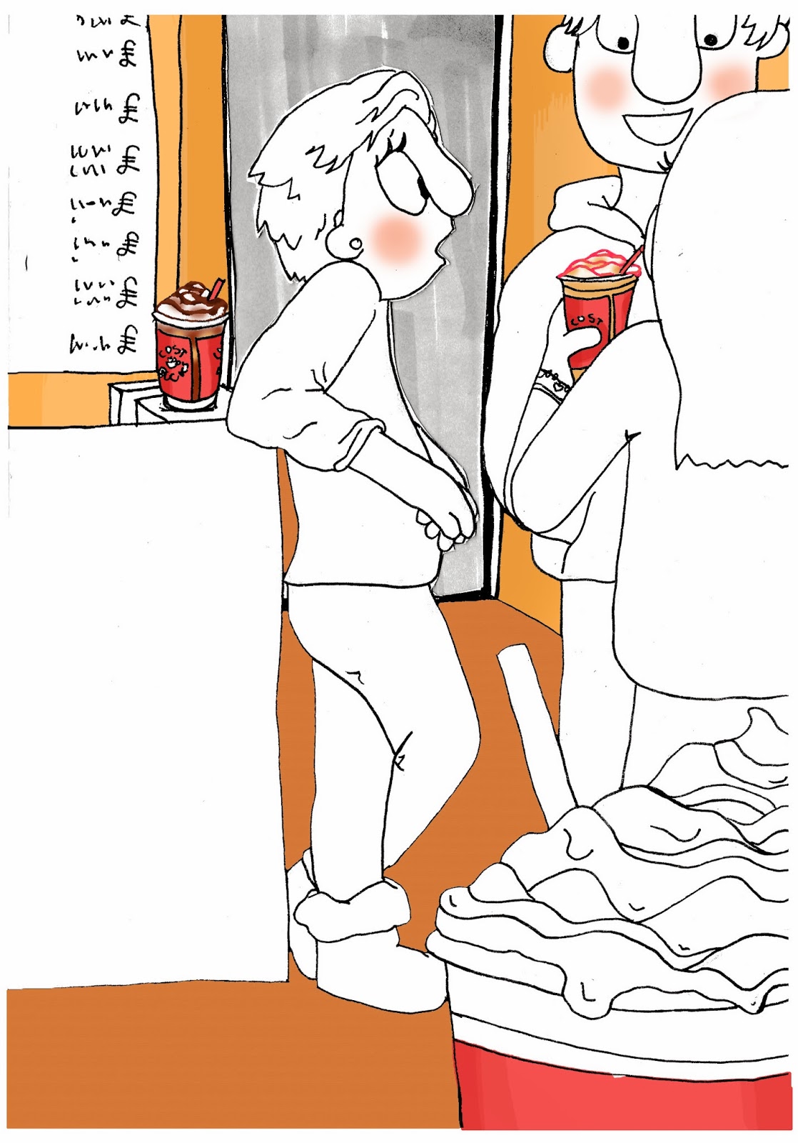
On Photoshop I began adding colour and backgrounds and some other details. So far I have done some backgrounds, the cheeks, and most of the coffee shops products.
Here are some enlargements showing detail on the food and drinks of the coffee shop:
Below is my tutors feedback:
This was extremely helpful as while I was working on Photoshop I found myself spending too much time on small details and he reminded me to keep it simple. I also improved my work by following his advice to 'avoid too much flat colour' so I added texture on Photoshop using the paint fill and paint brush tools. I had a lot of gestural marks in my drawings and these provided a problem as they were in the original black pen and stuck out to the audience, I solved this problem by using coloured lines to go over these gestural marks; I think this improved the look but I am sure with more practice I would be able to create even more synced gestural marks, perhaps through using a wacom tablet instead of the usual laptop pad. This is something I will most definitely explore in future projects. Below is my developed illustrations after receiving my tutors feedback:
Final Crit


This feedback shows that I was successful in my research methods and sketchbook work but that perhaps I should have practised using different tools for cutting out and different papers for the final book. I am also glad people found it 'warm' and 'really atmospheric' as that was something I was really aiming for in order to create the coffee shop scene. This feedback tells me the cutting out was successful and a good idea however could be improved by using, for example lazer cutting, to produce a smoother cut.


.JPG)


.JPG)


No comments:
Post a Comment