- 4 x stamps (5cm by 3cm)
- 4 x Postcards (10.5cm by 21cm)
- 1 x Poster (59.4cm x 42cm)
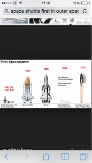
For my person of note I decided on Yuri Gagarin who was the first man in outer space. He was known as a family man with a winning smile and toured the world after his trip to outer space, representing the successes of the Soviet Union and communist way. He had been picked from his competitor after years of training mainly due to his background; his parents lived on a communal farm and his story became one of hope and an example of how under communism anyone can succeed. His life soon turned down hill after affairs and he only went on one other space mission; in which he sadly died. This tragedy has a lot of speculation over it and his story goes from triumph to tragedy in a matter of years. However I want to focus on why he was a person of note; and this was not because of the latter years but because of his success as the first man to go to outer space and because of his triumphs in allowing the Soviet Union to be seen as a success and inspirational around the world. He had done something no other on earth had ever done; and he had done it before the USA!
http://www.nasa.gov/mission_pages/shuttle/sts1/gagarin_anniversary.html
Below are some of my research images to be used for reference in this project:


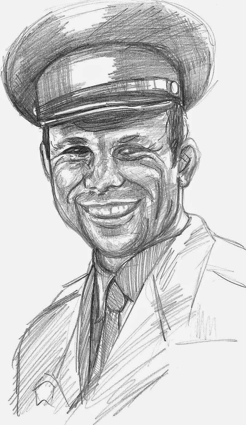
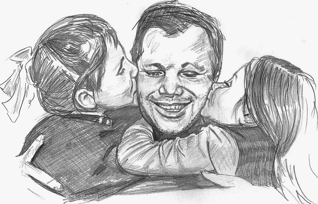
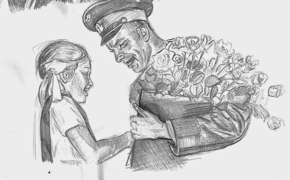
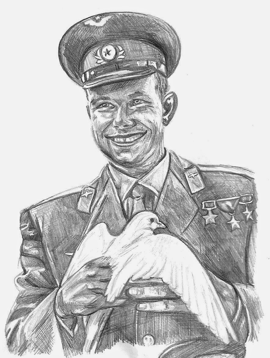
I researched deeply into his life and watched some documentaries about it which were extremely interesting. My main aspects I wish to focus on are of him being a family man, a handsome 'celebrity', an astronaut and as a product of the communist Soviet Union.
Below are some of my work from my sketchbook:


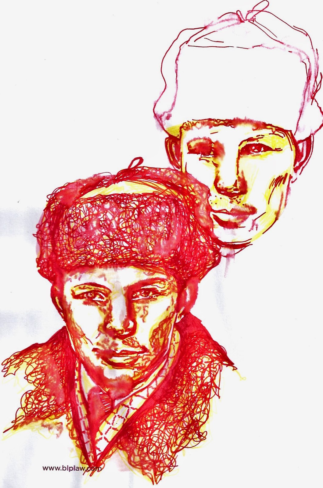
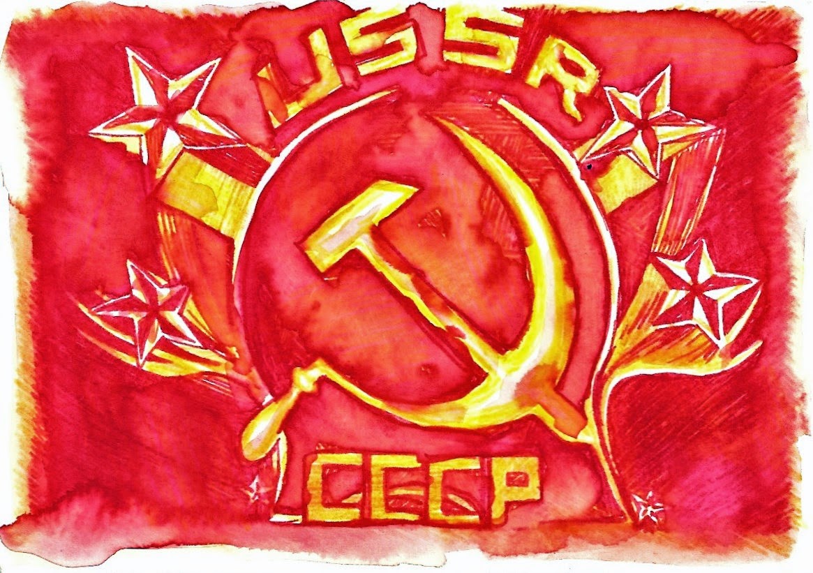
I really liked using collage however I decided to try using water colours as I wanted to use a particular colour scheme which may have been hard to find/achieve using collage given my time restraints. I decided to use the colour scheme of red and yellow as these represented the communist soviet party and this is extremely appropriate to incorporate into my work on Yuri Gagarin as he represented hope and the success of the party. He was used as an example; chosen as the first man to go into space due to his training and ability but also because of his background; a son of farmers from a communal farm. He showed how within a communist soviet society how everyone has an equal chance and anyone can be successful, to both the general soviet public and other nations. He toured the world representing his nation and its beliefs and was used as a promotional tool. He was also a family man (although by the downfall of his career his homelife broke down too with cheating allegations) during his success in space and presented this wholesome lifestyle during his fame afterwards. I have tried to present him in the prime of his career; portraying him as handsome (with a winning smile that 'lit up the cold war'), a family man, a communist/soviet, and an astronaut. He was a celebrity of his time.
Here are some of my pencil and water colour drawings exploring the above ideas:

.jpg)
.jpg)
.jpg)


n_edited-1.jpg)

.jpg)


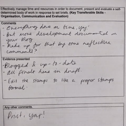
After receiving this feedback and being able to look at other peoples work I scaled all my pieces to the correct size and then printed them out and worked on my blog further. Below is my final poster which I printed out at A2 using matt paper.

I think it would have been stronger and cleaner cut using digital but to represent the era and context I thought hand painted would be more appropriate. I think I could have made it more detailed however overall I think it works well and the colour scheme looks effective.
Below are some of my research images to be used for reference in this project:


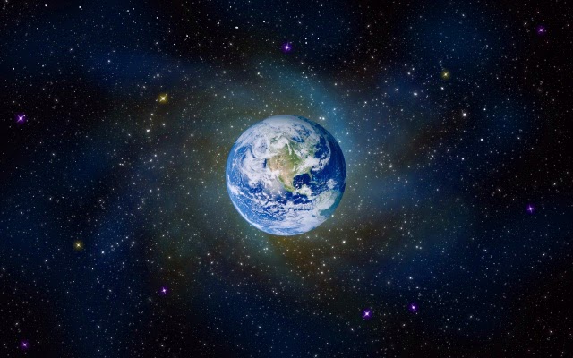
I researched deeply into his life and watched some documentaries about it which were extremely interesting. My main aspects I wish to focus on are of him being a family man, a handsome 'celebrity', an astronaut and as a product of the communist Soviet Union.
Below are some of my work from my sketchbook:
I really liked using collage however I decided to try using water colours as I wanted to use a particular colour scheme which may have been hard to find/achieve using collage given my time restraints. I decided to use the colour scheme of red and yellow as these represented the communist soviet party and this is extremely appropriate to incorporate into my work on Yuri Gagarin as he represented hope and the success of the party. He was used as an example; chosen as the first man to go into space due to his training and ability but also because of his background; a son of farmers from a communal farm. He showed how within a communist soviet society how everyone has an equal chance and anyone can be successful, to both the general soviet public and other nations. He toured the world representing his nation and its beliefs and was used as a promotional tool. He was also a family man (although by the downfall of his career his homelife broke down too with cheating allegations) during his success in space and presented this wholesome lifestyle during his fame afterwards. I have tried to present him in the prime of his career; portraying him as handsome (with a winning smile that 'lit up the cold war'), a family man, a communist/soviet, and an astronaut. He was a celebrity of his time.
Here are some of my pencil and water colour drawings exploring the above ideas:
I then decided to add a background using the layer tool on photoshop:
I really liked the effect that having multiple layers created and how it enhanced the message of communism and the Soviet Union which is essential in this work.
My final poster was created by using water colours and a few marks using felt tips. I wanted to portray the stars/space in the background whilst still using the colour scheme of red and yellow, and I also wanted to represent the Soviet Union with the communist symbol behind him to the right. I represented his successes in space using the medals and his charming smile to represent the successes of the Soviet Union and him as a family man as well as a heart throb.
Evaluations and Peer Crit:


After receiving this feedback and being able to look at other peoples work I scaled all my pieces to the correct size and then printed them out and worked on my blog further. Below is my final poster which I printed out at A2 using matt paper.


