Value relates to the chroma, saturation, purity or intensity, of any given colour.
Notan is a Japanese concept of how light and dark within an image can create harmony, dynamicism or beauty. Notan formalises similar principles of value in the composition of artwork.
I found this helpful blog which talks about colour particularly in fashion: http://www.colourlovers.com/fashion/blog/2008/05/30/the-colors-of-wear-palettes
Colour palettes are based on the principles of colour theory. Within your colour palette certain colours may contrast, accent, compliment, harmonise or vary. So when colouring your image, deciding the size and variety of your palette will dramatically change how your final work functions.
I find myself trying to use contrasting/complimentary colours, opposite in the color wheel, in my pieces a lot as I feel the need to bring the piece to the audiences attention with these clashing colours; to me it makes each colour stand powerfully alone whilst still being part of the overall image.
However I have been try to have a go at using limited and similar colours to see how effective this can be in my work and help to portray a certain message.
To use colour palette theory myself I developed a colour illustration through a series of roughs which had to include an object and a figure. I chose to focus on children; first trying out a child interacting with a buggy but then deciding to use a child trying out lipstick. I decided on this figure and object because I think they're really relevant to our culture as the age of putting on large amounts of makeup everyday is getting younger and younger.
I used a reference photograph however I adapted it and changed it. I decided to draw it out in pencil first:
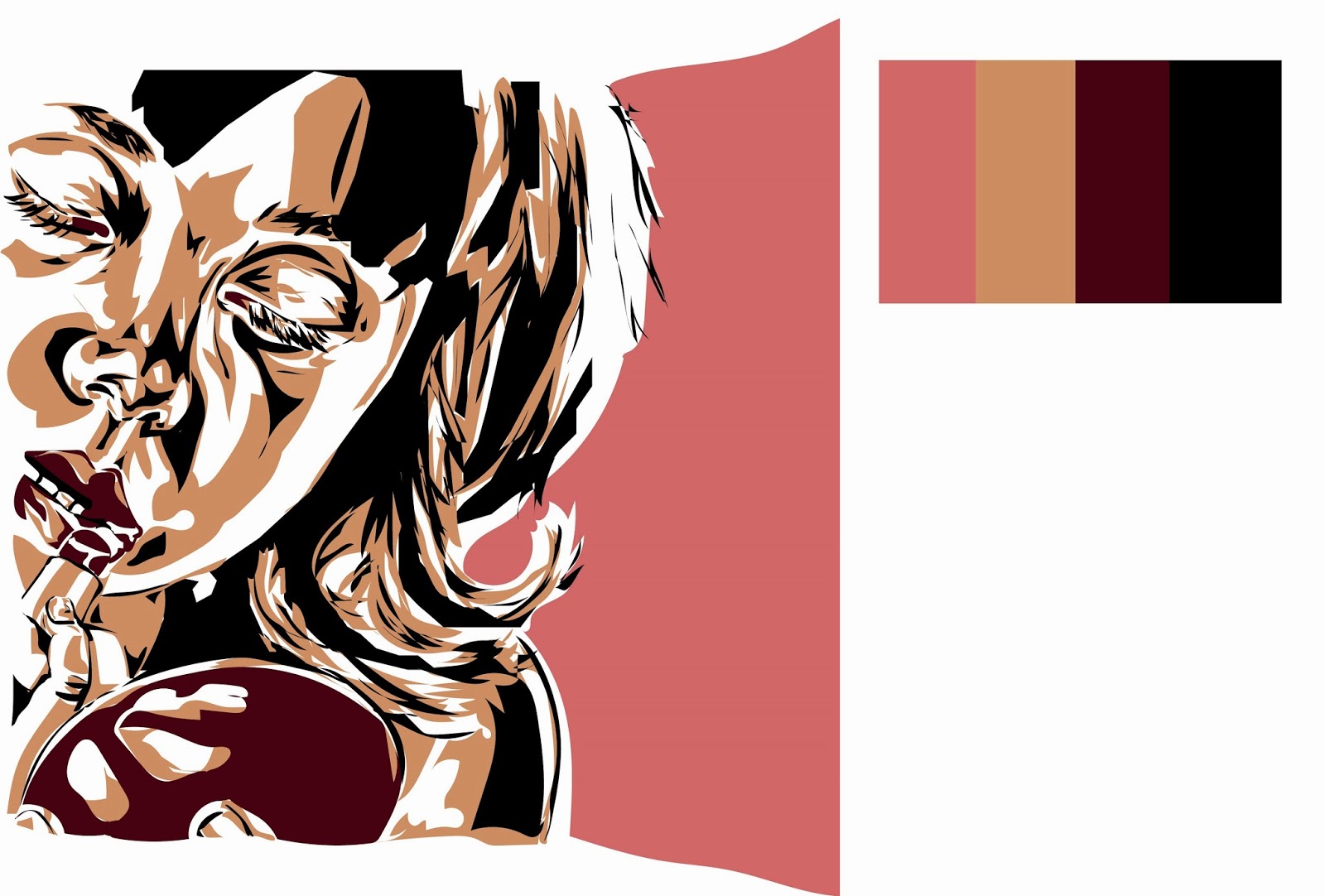
Then crop it to make the lipstick and eyes looking into the mirror a clear foreground and I cropped it right at the side of the lips and the mouth to bring these aspects to attention rather than leave the whole face in. I also decided to leave a section of plain colour as background on the right to portray the sense that the girl is almost secretly putting on the makeup - she is hiding to the side of the canvas.
After drawing it in detail using pencil I then edited it using photoshop to add colour and some white thin lines. I liked the realistic appearance pencil gave the image but after editing it on Photoshop I decided to re-design the image on illustrator instead as the colours were becoming too complex for me to just focus on three different components of the piece which is what I set out to do.
Here I have decided to try to use Adobe Illustrator to ensure my work fills the brief set as it was looking at three different colour values in one image. Below my work using this vector software, I have experimented with different colour backgrounds however I have focused on using three colour values: white (light), beige (and occassional background colour- medium colour value), and black/dark red (and occassional background colour- dark colour value).
Overall I think learning colour theory is great as it gives you more understanding of colour and how multiple colours can interact. However I love creating work as I go and deciding on the colours depending on initiative and what seems to work best for that particular piece. I think these pieces worked well but I feel they are missing some passion which arguably may have been achieved if I was just creating it from fluid working rather than thinking about colour theory too much. There is a larger amount of light and mid values in this piece, representing the innocent child, however there is also a decent amount of dark values balancing out this corrupting object; makeup. The makeup; lipstick and back of mirror are both a dark red; portraying a sinister tone to the piece and highlighting the dangers of wearing a mask of a woman when you are in fact only a girl.


No comments:
Post a Comment